Colour is a very powerful tool in providing meaning and symbolism to an image. As stated by Ambrose, G. & Harris, P. (2005:10), “Colour is perhaps the first element that we register when we view something for the first time. Our cultural development and conditioning mean that we will naturally make associations based upon the colours we see, and these provide an idea of how we should react to an object or design that incorporates them. Colours attach meaning, and our reaction to this will depend upon cultural associations, trends, age and individual preferences.“
Good example
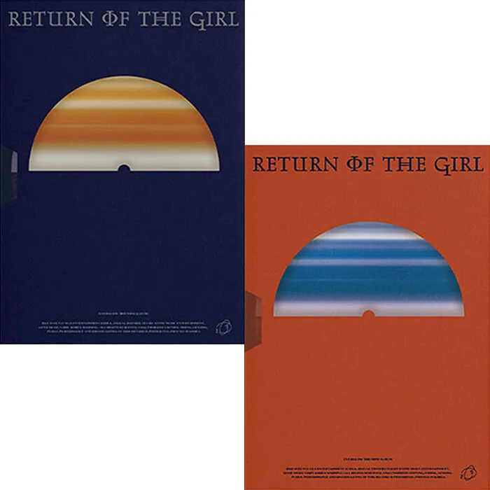
Everglow is a pop girl group which is recognized for their EDM-style music and for consistently pressing forward the message of girls and women being strong. They have six members, and have debuted in 2019. ‘Return of the Girl‘ continued with their trademark sound that is heavily influenced by EDM, but this time the narrative focuses on the members being ‘pirates’, or a symbol of defying societal expectations.
Everglow’s album ‘Return of the Girl‘ uses colour effectively to illustrate the style of the music and the symbolism behind it. The background consists of a deep orange, creating an almost suffocating quality due to the colour being commonly associated with sand and extremely hot temperatures. The semi-circle in the middle breaks up the suffocating atmosphere with a calming shade of dark blue, reminiscent of the ocean. The top of the image is adorned by the title of the record, Return of the Girl, which uses the Lancelot Pro font and almost creates a narrative alongside the simple imagery. Although this design prioritizes simplicity, it is successful in establishing the concept; the concept for this album being pirates in space.
To further illustrate this, Dorochowicz, A. & Kostek, B. (2019) stated that“Warmer colors (like red or yellow) are built from longer waves and consume more of people’s energy resulting in their stimulation, while cooler colors (like green or blue) consume much less of it, slowing the metabolism down, which results in soothing and relaxing effect.”
The reason behind this album cover using colours successfully is that it reverses the typical perception of colours regarding nature – this album design creates an image of a horizon with the sun rising halfway, however the colours are reversed. The serene waves are closed inside of the semi-circle, whilst sunrise surrounds the rest of the space. As for the alternate version of this album cover, the colours selected paint the idea of a planet in space, therefore connecting it to the original and fulfilling its purpose to fit the concept, and to create a narrative. To further add onto this, the style employed in this album cover fits well with the style of the music: the bright orange complements the electronic sound of the title track, as well as the simplicity of the shapes and the composition recalls the optimistic yet angular synths and melody present in the title track, ‘Pirate‘.
Poor example
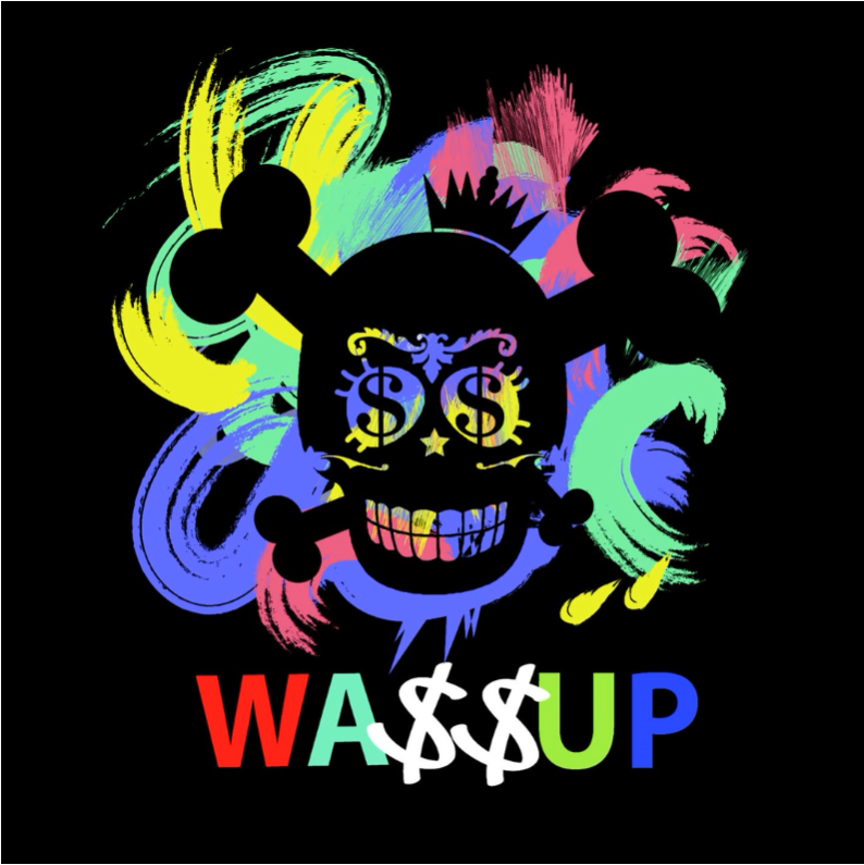

Wa$$up was a Korean girl group which consisted of seven members. They have debuted in 2013, and whilst they did not amass much recognition, they were most known for their hiphop-inspired sound. ‘Showtime‘ was their only studio album, being released in 2014. They had a fierce, although sometimes sweet image associated with them and their music.
When it comes to poor use of colour in regard to album covers, ‘Showtime‘ by Wa$$up fits the criteria. This is because the colour palette has an abudance of colours which do not harmonize with each other well. The intention of these colour choices was to evoke feelings of carelessness and not being afraid of expressing themselves. Whilst the colours used for the group’s name are fully saturated, they are not synced with the colours used for the paintbrush strokes in the background, creating an overall lack of cohesion and a sense of chaos. In order to improve this album cover’s use of colour and bring it to its full potential, I have decided to limit the palette to 4 main colours – lime green, purple, black and white. The reason behind lime green being selected as the main colour is because it is often connoted with liveliness and high energy, which is applicable to most of the songs on this record. Another association that I intended the green colour to have is to the stereotypical colour of toxicity due to the sour quality of autotune on some tracks.
The secondary, non-monochrome colour which I decided to use was dusty purple seeing as it usually alludes to feelings of sentimentality, softness and vulnerability. This is fitting for this album because one of the tracks (“Hug Me”) presents a calmer side of the group, which is shown only on rare occasions. Unified, these colours joint together communicate a sense of versatility that this group displays, as well as creating an energizing palette. Another reason why both of these colours were selected is that they are distanced from each other on the colour wheel, therefore creating contrast which is further demonstrated by the use of black and white. The high contrast in between the colours is also meant to represent the polarizing and new approach to music style that is not very common amongst Korean idol pop groups.
Harvard References
Ambrose, G. & Harris, P. (2005) Basics design 05: colour. Case Postale: AVA Publishing SA.
Dorochowicz, A. & Kostek, B. (2019) Relationship between album cover design and music genres. 2019 Signal Processing: Algorithms, Architectures, Arrangements, and Applications (SPA), 2. Available online: https://ieeexplore.ieee.org/abstract/document/8936738 [Accessed 3/11/2023].
EVERGLOW (2021) Return of the Girl [Audio CD]. Yuehua Entertainment.
WA$$UP (2014) Showtime [Digital]. Mafia Records.
Leave a Reply