The process of creating a logo for my subject brand began with trying to connect two or more ideas for the title. I have selected “Synesthemusic” as the title of my brand because the point of my project is to connect the different sensory experiences with music through album packaging. “Synesthesia” is a condition where experiencing one type of sense leads to experiencing a different sensory feeling. The reason why I have combined this word with “music” is to present my purpose of drawing my audience’s attention to the other senses whilst interacting with the product I’m providing.
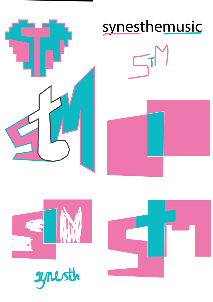
The first iteration of the logo was a simplified, 3D rendition of an opened CD jewel case. This version was overly simplified and did not have any conceptual design, therefore, it has evolved further. After that, I have attempted to make the shape two-dimensional instead and to present a contrast in between the two boxes, drawing similarity to a Venn diagram to present that I am trying to combine sensory experiences. This was not successful as the idea still was not clear enough. Furthermore, I have applied the shape of a volume mixer and placed the previous design attempt inside of it to create a more obvious idea. I have tried multiple iterations of this idea before coming to the conclusion that I should highlight the overlap of sensations more instead of focusing mainly on music equipment. After this, I have decided to add some dimension to the letters to make them look like they are flying off the page in order to add some interest. The name of the company gets shortened to the three letters, “STM”, so that there is more freedom for creating new shapes. The ‘T’ has become a music note, being a bridge in between the two letters and creating balance by being the smallest letter. The rectangular shape of ‘S’ has led me into transforming it into a path shape – this has been done to present the journey that the music artist can take to become truly themselves. Another element of the conceptual design which is present in this logo currently is the ‘M’ which takes on the shape of a pixelated heart – this is meant to represent the digital medium of music, as well as the love for it. Furthermore, the ‘t’ acts as a bridge in between the two letters – it bridges the gap between the journey of creating music, and releasing it digitally for people to listen to, which is the primary purpose of a music company. Another interpretation of the ‘t’ shape could be that it is the multiplier symbol – this calls back to the original meaning of Synesthemusic, which is combining different mediums and sensory experiences to bring new ideas for the audiences in order to inspire them back. As for the typographical element of this logo, I have handwritten the title of the brand using rectangular shaped and thin letters in order to add to the effect of it looking digital.
Leave a Reply