The typographical standards hold great significance in the graphic design industry, and in the occasion of creating one’s own branding. The graphic standards will ensure that other graphic designers will be able to get the details done correctly.
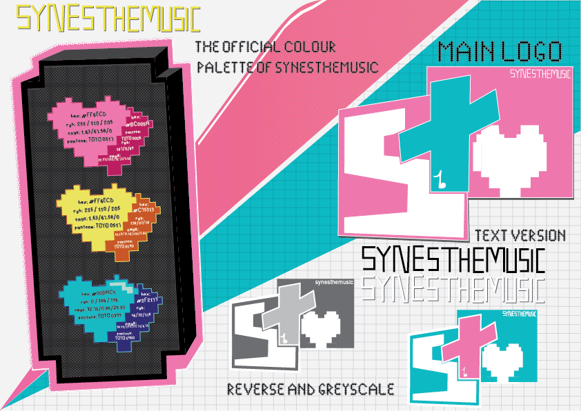
The first typographical page includes some necessary information such as the main colour combination, and the logo which represents Synesthemusic. The three colours that I decided were suitable for my brand are bright pink, yellow and blue due to the versatility of these colours, and due to the fact that they are harmonious with each other. I have included different variations of the logo so that any outsider design company can reference back to it and use it in a way that is fitting to the brand.
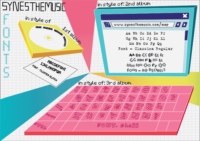
The second typographical page focuses on the font and text usage. I have created illustrations in order to present the text in a unique way – this has been done in order to establish the image of my brand as Synesthemusic more firmly. I have seperated each section on an album basis so that it is easier for other designers to recreate the typographical style. I have selected the fonts on the basis of the sounds that are found in the album – for example, the second album uses a hand-drawn typewriter style font in order to symbolize the guitars that are in many of the songs.
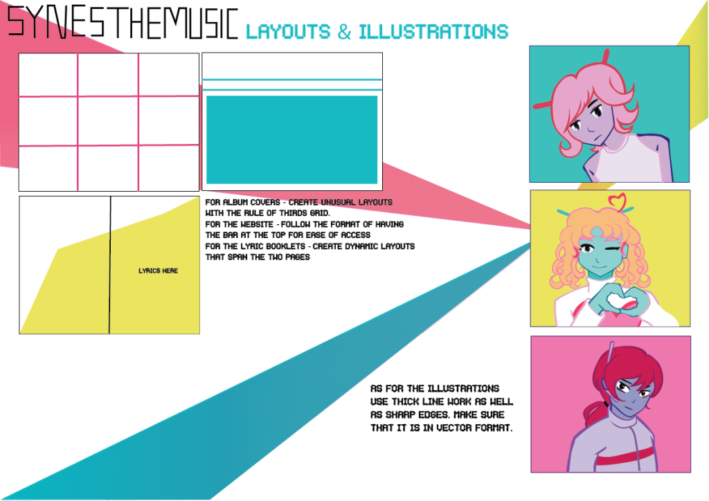
The final typographical page presents the layout and illustration style which is the main part of what makes Synesthemusic stand out. Firstly, the layout is rather simple and conventional in order to make it easier for the designs to stay consistent with each other. The difference in these layouts is that I have decided that they should use those simple layouts in more creative ways, such as treating the 3×3 squares as pixels, with some of them presenting different images as a reference to machines glitching, therefore linking back to the signature style of Synesthemusic. The illustrations of the characters are meant to aid the audience in visualizng who the albums are about and to help designers with what colours schemes to keep and how the character is designed.
Overall, in order to keep the typographical standard sheets consistent with each other, I have used the three triangles as an element and used the exact same colours as well as including the name of the brand on the sheet in order for them to be recognized instantly.
Leave a Reply