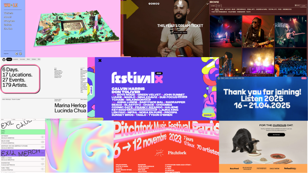
The colour palette of a web and app product can heavily determine how a user will interact with it and it can also create lasting impressions in the user’s subconcious due to the psychological effects that colours can have. According to Lopez (2023), the 60:30:10 theory is often used in various design fields as it presents a way to present a colour palette in a balanced way to avoid everything being too similar or too cluttered. The survey that I conducted earlier revealed that the three colours most associated with rock music were red, black, grey and purple. This result has affected the colour planning stage of the process because it implies that a majority of people associate rock music (the focal point of the festival) with those colours, therefore they might be fitting. In addition, I have preserved the rainbow colour scheme that is present in the original iterations of the Pol’and’Rock branding, however I have included it in smaller amounts and in a subtler way in order to decrease the overload of colour in favour of a simpler palette. When it comes to symbolism and colour psychology, the usage of the rainbow can be justified by its associations to peace and harmony, two of the values that the Pol’and’Rock festival prides itself over. Furthermore, it also portrays the diversity and mass appeal of the festival due to the abundance of activities and music genres that it has took acclaim for.
The dark red colour is a colour commonly associated with the rock genre, possibly because of the image of a red guitar as well as red being a loud and rebellious hue. The shades of purple that are present in this colour palette are meant to symbolize a sense of creativity and pride, as well as creating contrast between itself and the colour red.

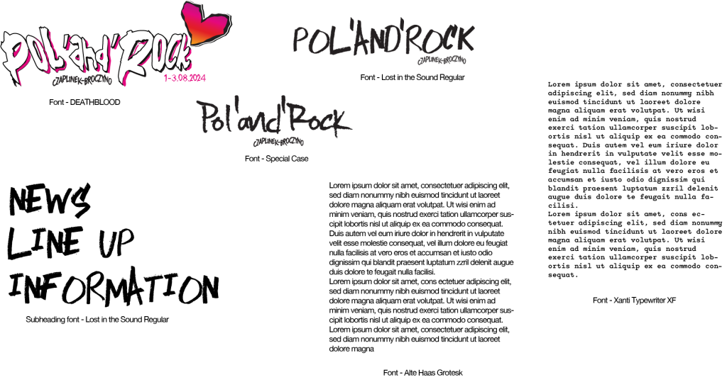
In terms of typography, I have carefully searched through mutiple sources that offer fonts and found a few which fit the purpose and branding of this festival. For the main title logo, I have used the Deathblood font and customized it in order to create a slightly chaotic and artistic atmosphere which is associated with the Pol’and’Rock festival. The subheadings present on each subsection of the site are written with the Lost in the Sound font, and it presents a marker-like texture as well as being a script font which harmonised well with the font used in the heading. I have made sure to prioritize the aspect of the text being readable without losing its stylistic qualities that encompass the creative vision behind the festival. As for the body text, I have decided to select a simple and sleek font with a typewriter feeling to it – when creating a website or app, it is incredibly important to keep legibility and ease of readability at the front of your consciousness since if it is neglected, the product will end up unusable and it will go against the customer needs.

Harvard Referencing
Lopez, J. (2023) The 60–30–10 rule: a foolproof way to choose colors for your UI design. Available online: https://uxplanet.org/the-60-30-10-rule-a-foolproof-way-to-choose-colors-for-your-ui-design-d15625e56d25 [Accessed 4/4/2024].
Leave a Reply