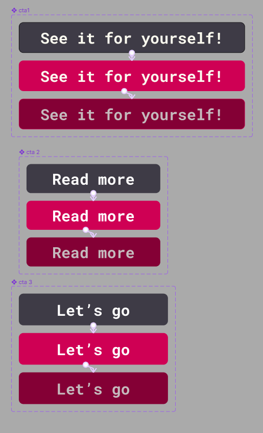
One of the many elements which make a user experience design engaging includes the call to action buttons. The function of a call-to-action button is to enagage the viewers and act as a device that will answer their questions they might have about the product. In this case, I have created numerous responsive call-to-action designs which should incite the user to look through the history of the Pol’and’Rock festival and decide whether they would like to experience it for themselves next time they have a chance. The tone of speech used in call-to-action holds significance due to the fact that if it is used in a creative and casual manner, it might stick in their mind and encourage them to interact with the product of the festival on a more frequent basis. Another important thing to note about call-to-action is its need to stand out against the other elements through the usage of fitting typography and contrasting colours – the ideal way to utilize colour in call-to-action is to treat it as the 10% in the 60:30:10 colour theory as an accent colour to ensure that it pops on the website. Furthermore, in order to increase functionality, hovering over the button causes it to change colour in order to communicate to the user that it is clickable and intended to be interacted with. It is crucial to indicate points of interaction when it comes to user experience because if there are flaws in that aspect, it will affect how the user navigates the website and it might restrict them from all of the features, therefore it will impact the usability negatively.
For this task, I have developed a series of mid-fidelity layouts for both a website and companion app for the Pol’and’Rock festival. One way in which it has evolved from the previous, low-fidelity layout and sketches is the focus on spacing which will allow the website to feel more organized than it might have done originally. My main goal with this design was to make a simple but compelling layout and hierarchy so that the user can easily navigate through the site without any complications or confusions. Furthermore, the next step of the process would include user testing and prototyping to check whether the flow is the best that it could possibly be, and that there are no disruptions in the way of the user accessing the product.
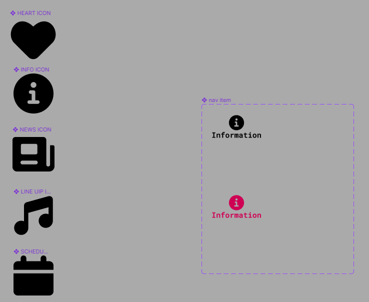
The navigation bar which I have created for the purpose of seperating the app into categories for ease of use, includes five categories: Line-up, favourites, news, information and schedule. The reason behind these categories being chosen is that those options are the most commonly needed pieces of information amongst the festival attendees.