In order for user needs to be put forward in terms of importance, I have conducted another survey to determine what the target audience prioritizes in website and app design. The sample size of this survey is larger than the previous due to the fact that I have asked people across different platforms to complete it, increasing chances of more responses. This survey has helped me in determining what the target audience associates visually with the Pol’and’Rock Festival, as well as figuring out which features are more sought after than others. I have asked the audience a question regarding the style of the website, requiring them to pick between different popular music festival styles which appeared on my moodboard for the website. This question was asked in order to determine what atmosphere do the audience associates the Pol’and’Rock festival with.
Moving forward from the previous research task, I have considered the user research and the user journey map to ensure that the problem space is still being adressed, in addition to the fact that the further the user experience design process goes, the clearer the problem space is therefore becoming clearer and easier to adress through the means of design.
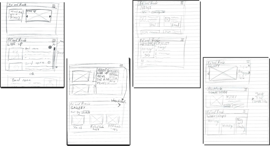
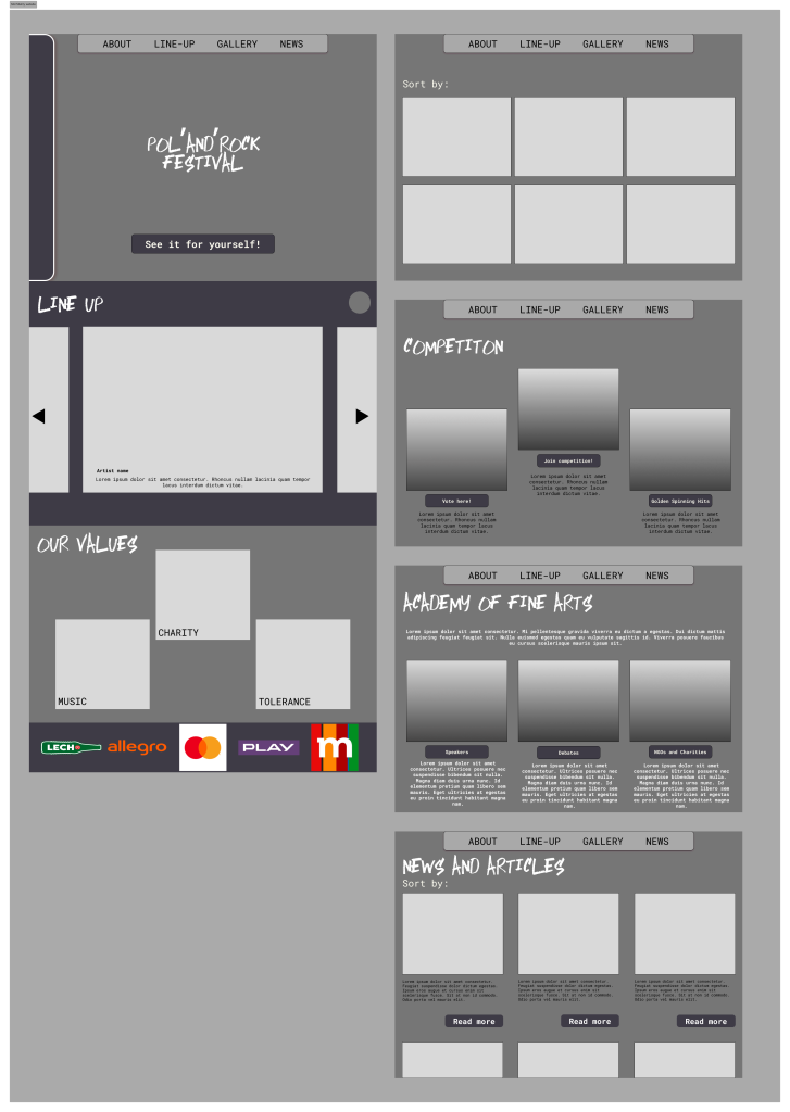
Before creating my mid-fidelity layout, I have created a range of quick sketches in order to determine the rough flow and layout that the website is eventually going to have. I have evolved this from the previous task by changing where elements are placed in order to increase usability and aesthetics. These sketches have evolved from the hierarchal task analysis, presenting how each page links with another and how everything flows. The reason behind this stage being important is that it ensures that all of the user needs are met and the functions make perfect sense.
The website for the festival contains a footer which presents the sponsors of the festival to the audience, successfully fulfilling the purpose which some of the stakeholders were searching for. This element is important because it puts the needs of the stakeholders and sponsors at the forefront, and they are the motivation and force behind the product.
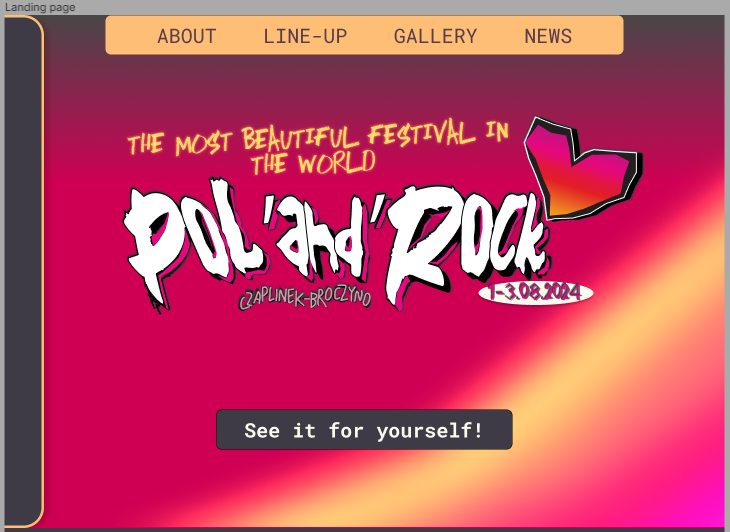
The landing page of the website presents the logo with bold lettering as the focal point of the page and I have included a gradient, rainbow overlay over the original colour palette to increase contrast and harmony as well as paying homage to the rainbows present in the original version of the Pol’and’Rock website. The conventional landing page usually includes a call-to-action button utilizing creative wording to invite new users to click on it and visit the full website, driving engagement up and increasing profits for some of the stakeholders.
Figma File Link