Typography is an element of design which holds great importance in the context of music albums and music packaging. The typography that is included within a design can easily convey the style that the artist is presenting, or fail at communicating its purpose to its audience or lacking legibility in the general sense, creating immense confusion.
Good example
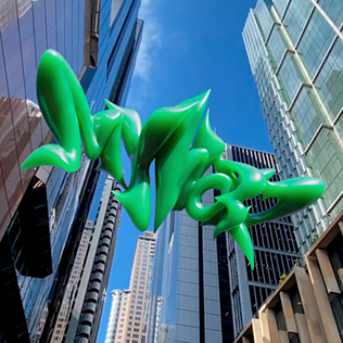
Aespa is a four-membered girl group which has a detailed storyline revolving around a fictional science-fiction world. They are famous for including experimental electronic components to their music. ‘MY WORLD‘ is their third extended play album which focuses on the theme of science fiction being incorporated into the real world.
‘MY WORLD’ by Aespa showcases a different take on typography that is usually present on album cover designs; it incorporates the text to be inseparable from the image. This differentiates this use of typography on this cover due to the fact that usually the title is placed on top of the main image however in this case it is entwined. The title ‘MY WORLD’ is shown to be a bridge between two tall buildings, its vivid green colour standing against the realistic background, creating a gap between reality and escapist fantasy. The use of neon green was successful because it is incredibly unnatural, and it stands out immediately. The letters are not instantly legible due to the small proximity between each letter – the words are melting into one another due to the kerning. The text itself has a plastic texture, which reveals the fact that the text was created digitally. This cover does not use an already existing font; instead, it creates it own which further fits the message of not fitting inside of the mould. ‘MY WORLD‘ succeeds in appealing to its audience by following this release with a style that resembles their previous works, but still makes sure to be innovative in a way.
There is a link between the stylistic choices in the music and the artwork made to represent it, therefore making it fulfil its own purpose. The title track of this album has an edgy but softened texture – the drums have a slightly plastic quality to them, and the vocals have been smoothed to fit within the style. The shape of the letters is quite warped and distorted, creating a link to the experimental sound that Aespa is known for. The shiny quality of the letters implies that they shine and stand out as a group amongst the others, whilst also creating a connection to how polished most of their music sounds.
Poor example
ONEUS is a five-membered idol boygroup which has debuted in 2019. Their style of sound is usually upbeat. ‘Dopamine‘ is their second full studio album.
This usage of typography fails to fulfil its purpose (be fitting for the style of music it is representative of) and as a result disappoints its audience. This is because the font used for the main title resembles a style that would be used for an engineering company, and not an album cover for a music group with a happy, bubbly image. The main fault of this design is its dullness and lack of other elements to accentuate the typography. The fonts on the original cover are: a slightly rounded serif font which is situated in the middle, as well as the simplified, futuristic font of the group name.
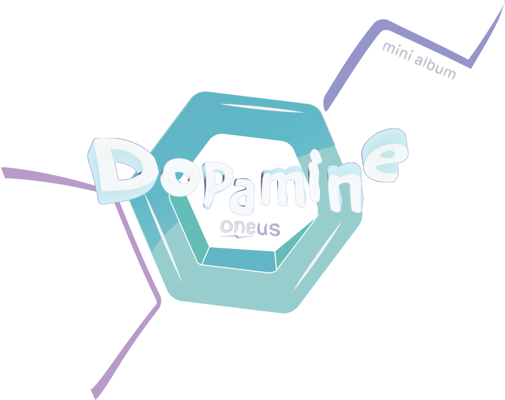
The name of the group is written in a smaller, capital-sized lettering, with ‘ONE’ being bolded to symbolise that ONEUS is a combination of ‘one’ and ‘us’. This is an element that is kept consistent throughout the majority of ONEUS’ catalogue. In the re-designed version, I have made the decision to turn the letters lowercase, to make the design seem softer and to reflect the way that the song sounds. The metallic texture that has been applied to the lettering in the original cover suggest that the group has a tough image, although that is not true therefore I have altered the text and illustration to have a matte texture to better reflect the image they are trying to achieve. I have tried to preserve the minimalistic nature of the original by keeping the background white and containing the information in proximity to the logo in the centre.
According to Venkatesan, T. & Wang, Q.J. & Spence, C. (2020), research suggests that curved typefaces usually evoke more positive emotions than angular typefaces. This is one of the reasons behind the typeface being rounded and soft, as it might evoke feelings of happiness, further linking to the dopamine theme.
Although I have decided to keep the cool tones from the original alongside its scientific themes, the new version tries to give it a more lively atmosphere with 3D typography that fits inside of the dopamine formula. In spite of the fact that dopamine is presented as a chemical of happiness, the colour choice remains cold due to its scientific associations and to create a calming effect.
Harvard Referencing
Aespa (2023) MY WORLD [Digital]. SM Entertainment.
ONEUS (2023) Dopamine [Digital]. RBW Entertainment.
Venkatesan, T. & Wang, Q.J. & Spence, C. (2020) Running head: the typeface of music. Available online: https://ora.ox.ac.uk/objects/uuid:7beb83c1-86ab-4fe4-b1d4-78297324d8a5/download_file?file_format=application%2Fpdf&safe_filename=PACA%2BAuthor%2BAccepted%2BSubmission.pdf&type_of_work=Journal+article [Accessed
2/11/2023].
Leave a Reply