1. Initial planning and ideas
After further consideration, I have developed the initial plans and goals outlined in the proposal post and altered some of them. Firstly, I have tried to think of an overarching theme for the campaign which is going to bind all of the branding, online presence and offline presence aspects together.
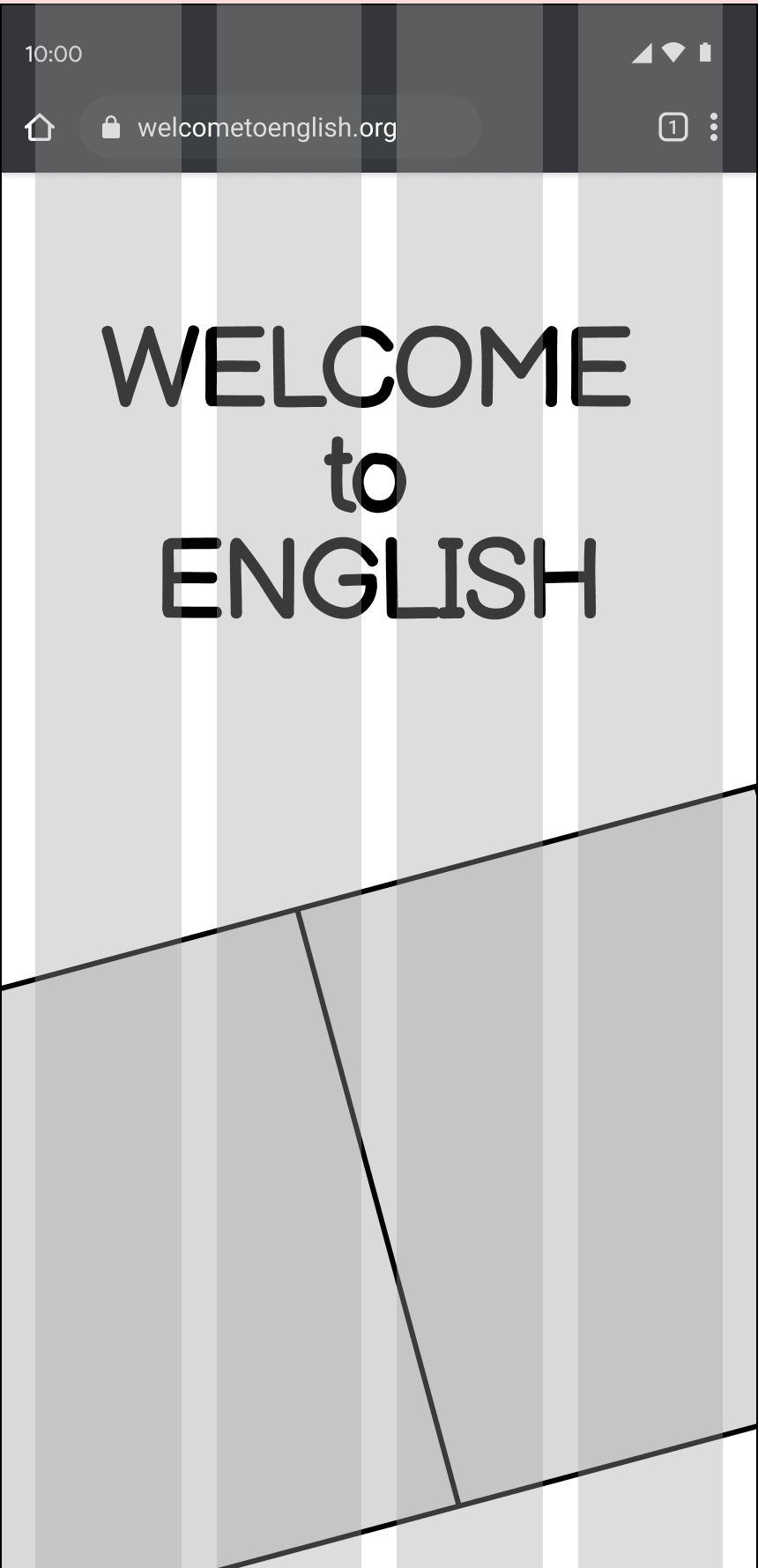
An important thing to consider is what the problem space is, as that is the foundation of UX design. The problem space of the web design for Welcome to English is being able to present information for newcomers to England in a way that feels welcoming and easy to understand even for someone who doesn’t speak the language.
Typography
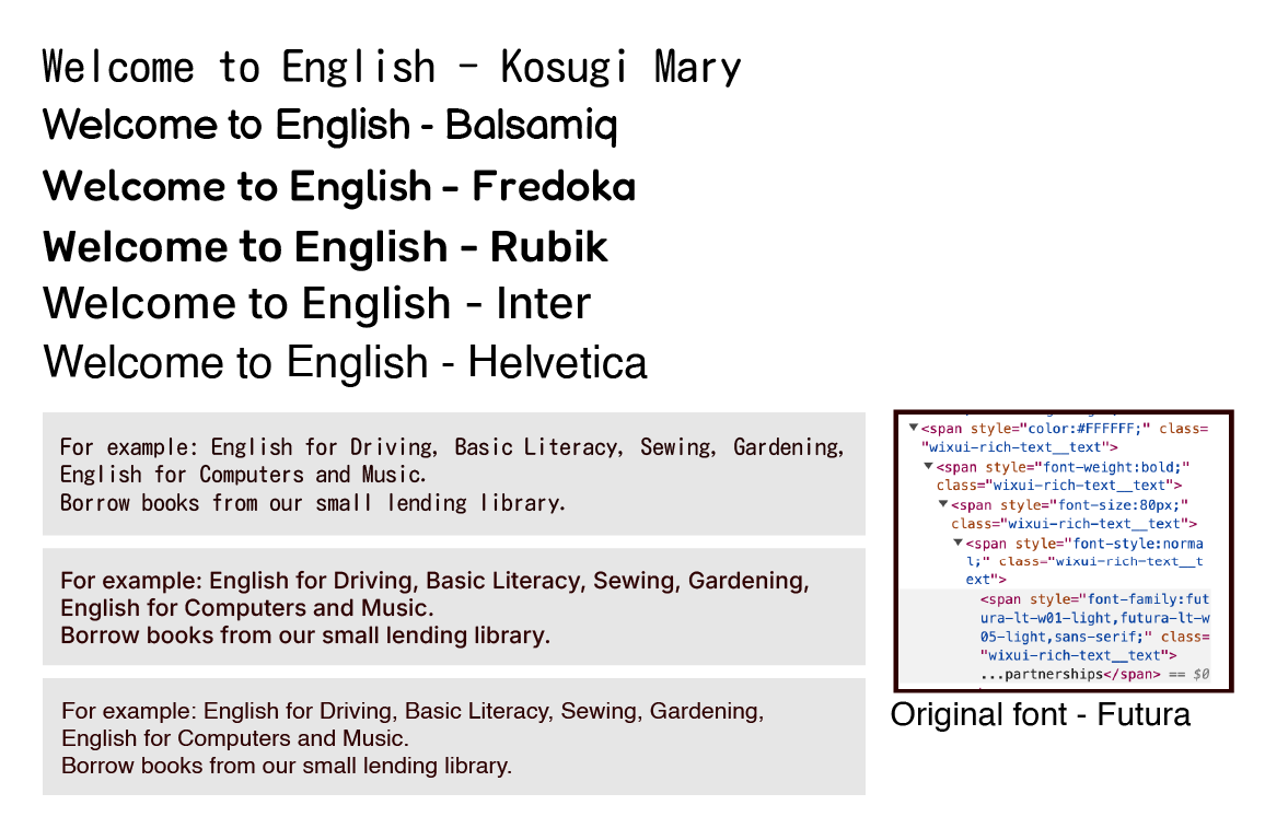
When selecting the font for the body type of the website, I have decided to use sans-serif and humanist fonts in order to ensure accessibility. When designing a website, it is recommended to use more commonly used fonts, as the more obscure ones might not be compatible with all devices. After trying the fonts pictured above, I have decided on using Balsamiq for the headers and Helvetica for the body text. One problem that I have encountered is the lack of availability of Helvetica on many platforms as a free option, therefore I have changed the body font to Inter as it is still similar, however it is more accessible. I have selected Balsamiq due to its playful and friendly style, which slightly resembles a person’s handwriting however it is still neat and legible.
Colour Scheme
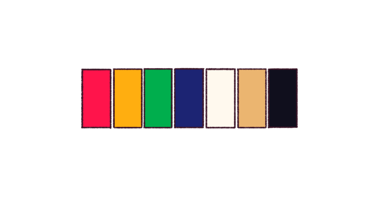
This colour palette that I have created is meant to be bold and vibrant and slightly resemble a rainbow to add variety to the overall colour make-up of the website, which will be off-white and beige mainly in order to communicate a paper-like style. These vibrant colours are meant to accentuate the duller main components of the colour palette. The variety of bright colours is meant to represent the wide variety of people who are involved with Welcome to English, and it is also meant to represent the fact that there is not only one right way to speak English.
Logo
Initially, I have looked at the original Welcome to English logo and concluded that it is weak as a logo – it is not scaleable and is low-quality if you try to scale it up. Additionally, it is weak in terms of the design, as it is not visually pleasing or communicative of its purpose. Also, the colour scheme is rather mono-chromatic and does not apply much contrast which could be beneficial for the design to stand out. The first re-design of the logo focuses on trying to recreate the simple idea of a speech bubble indicating someone being welcomed to English (or the NPO). I have experimented with different icons that indicate the purpose of the organisation as well as trying different colour schemes to see which one is the most effective in simplified forms.
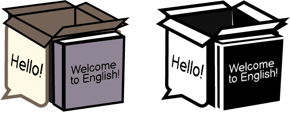
The second logo that I created started as a 3D cube shape, inspired by miniature room cubes which are present on some trendy websites. On one side, there is a book, presenting the written word; on the other side, there is a speech bubble representing the welcoming atmosphere of the classes. These two elements are surrounding a box, which is meant to represent the surprises that one may encounter in daily life, or could refer to the phrase “outside of the box”. The reason why this logo might not be suitable is due to the fact that it is too intricate and it would lose details if it was scaled differently. Alternatively, I have the idea to use this shape on the main page of the website, acting as a reference to the forementioned websites. I will also add confetti to the box when I will place it on the website – this will be done to accentuate the surprise element and further incorporate more colours to the website subtly.

The final logo that I have ended up with is incredibly simple compared to the previous ones – it is a 3D green speech bubble which is tilted at an angle and uses the brand-assigned font. The reason why in the end I have selected this logo is that it is not distracting (compared to the previous logos) and also it blends with the other colours of the website better – the previous logos have used older colour palettes which I have decided against using due to the fact that they did not communicate the message of the Welcome to English brand.
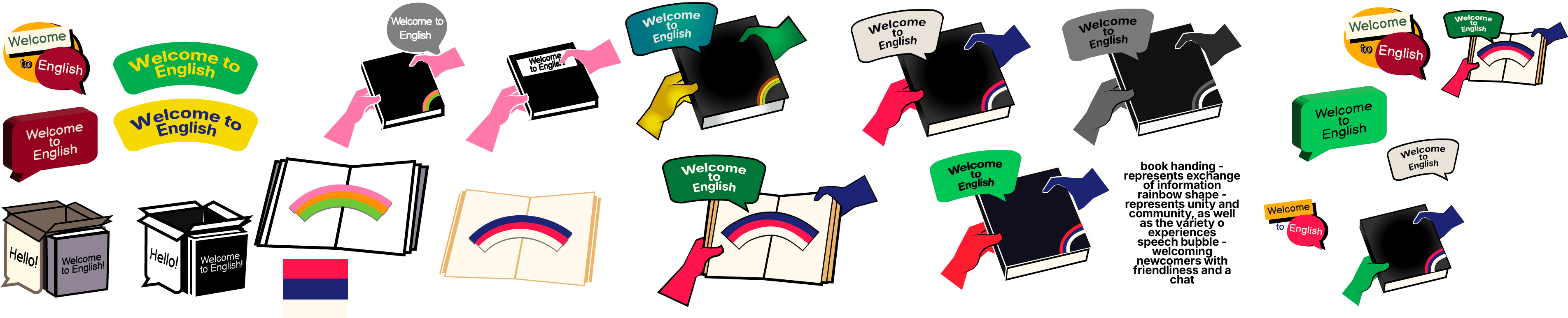
The image above presents the evolution that the logo for Welcome to English has gone through in order to illustrate my issue with indecisiveness.
Branding
Grid systems and responsive considerations
The grid system is an essential part of keeping the website structure proportional and applying responsive design to it. When it comes to the mobile grid system, I have used the typical layout that is expected for mobile websites, which is 4 columns with a 20pt. margin.
Originally, I have planned to start with creating the desktop browser version of the website, and then doing the graceful degradation, however I reconsidered it and decided to do the opposite of that technique – progressive enhancement. According to Korolyov (2017), progressive enhancement can be greatly beneficial in the long run of designing a functional website since you have to work with not having the ability to add all extravagant features as the mobile phone is weaker than the computer in the amount of features it can handle.
Styles and inspirations
Duck English (2024) has been influential in terms of the creative and trendy elements which it employs – the first thing which the user encounters on this site is a word pop-up element which resembles the act of sticking small stickers onto a page and they peel off quickly. I was inspired by this element therefore I decided to add it to the Welcome to Englsh website as it perfectly fits the paper and stationary theme that was established.
One of my goals in terms of improving the website is to incorporate storytelling in order to include it in the overall campaign and branding which is meant to present to the future user why they should be interested in it, and if it has any personal meaning to them. The story related to Welcome to English would include a monthly ‘theme’ for the website which would feature different people’s experiences with the said theme.The themes will be based around daily activities and common life experiences as it would be important to learn the language surrounding these issues in order to navigate daily life easily.
2. Updates and iterations
Features, HTA
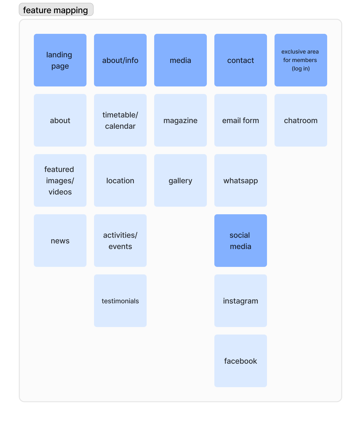
Feature Mapping
Hierarchal Task Analysis
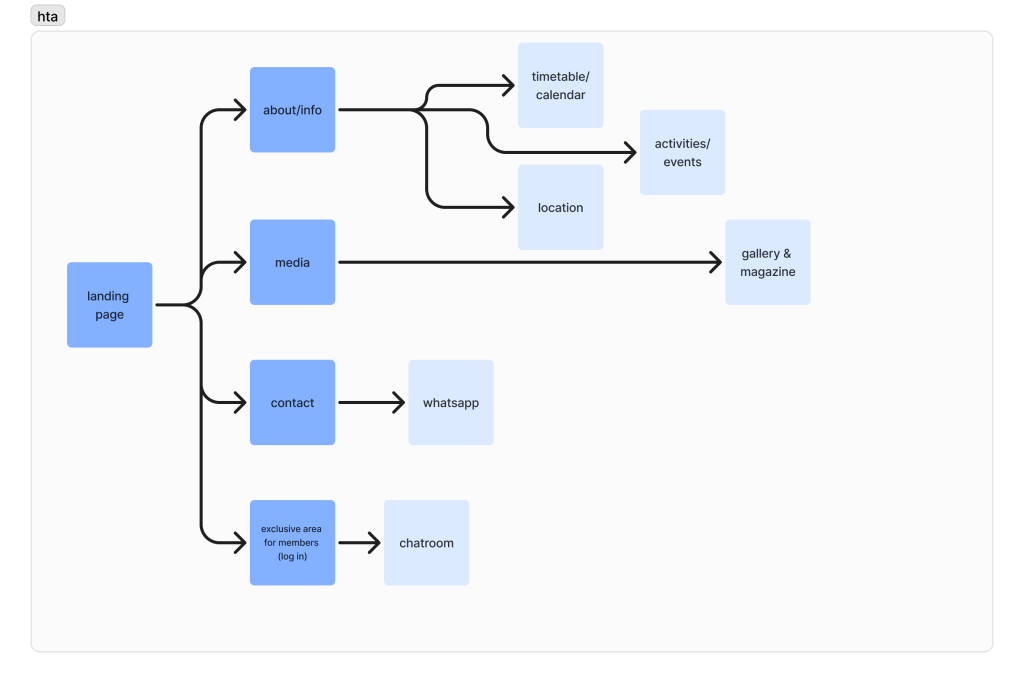
Before creating the low-fidelity wireframes, I decided to focus on visualizing the features that will be added to the website, as well as the system user flow which presents the usual journey that the user is expected to take. I have done this to establish a foundation for everything. The hierarchal task analysis is similar to how it was originally, however I have made some changes to the categorization of certain pages – for example, I have decided to include the volunteer-made magazine in the media section as to not clutter up the navigation bar.
First Idea
I have attempted to create an alternate idea for the website, so that if the book concept doesn’t work, there is a different idea to conceptualise. The idea behind this is presenting a story with a character who is in the same situation as the primary target audience in order for the purpose of the organisation to stand out immediately.
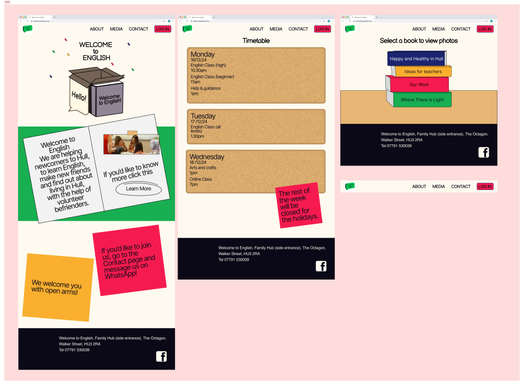
The timetable which is presented on the current website is a PNG file embedded onto the page – when the user clicks on it, it opens a new tab. I believe that this is not the best way to present this information because it uses server storage and it does not look professional. On the other hand, I believe there should be a weekly timetable sheet which is suitable for printing out and handing out. It is also important to note that this timetable changes weekly, therefore it could be beneficial to use templates which can be easily edited whilst still maintaining the branding. Also, this timetable could be incorporated into the multi-channel marketing strategy through giving the users the ability to log onto the website and opt in for e-mail and SMS updates, or potentially the website could provide a notifications feature.
In terms of wireframes, I have created a series of sketches to help me visualise the features and structures of the page included in the Welcome to English re-design. I have created the sketches with the mobile-first approach in mind as most people browse the web using their phones.
Book Website Concept
I have created a mock-up of the conceptual version of the website which focuses on the story-telling aspect. The reason behind the website having a book layout is that it can be universally understood, regardless if one can speak English (although the website is going to have translation options). Also, it is a more engaging way of organizing information.
The one issue with this layout is fitting it onto smaller screens – I was and still am unsure on how to tackle this. One potential solution could be only showing one page at a time, however it would not have the same effect as a fully opened, double-sided book.
Paper-based Website Concept
Paper is an incredibly simple but versatile object that can be used in multiple facets of our life. It is especially important in terms of education and language learning as you need to be able to write down things on paper in order to memorize and recall them. It is also essential for expressing creativity in some cases, such as drawing, doodling or writing creatively as well as many other art forms such as the origami. This links back to the website because it explains why it would be a fitting style for the branding overall.
Experimentation
During this project, I attempted some experimentation with tools that I have not worked with before much (or at all) to see whether they would be of any advantage in the creation of this website and campaign.
I have attempted to use WordPress Elementor in order to recreate the book idea with tabs – it partially works, however it does not look how I intended. The transitions between the pages are very awkward and don’t resemble turning pages in a book. Also, there is the additional problem with many of the features being locked behind an expensive subscription, making it less feasible compared to the alternatives, such as Figma.
One feature that I wish was present (or easy to implement) on Figma is the ability to add Google map extracts that can be interacted with. The original Welcome to English website has a Google map in their “Contact” page, and they created the website using Wix so some of the features between Wix and Figma are different. This made it a bit difficult to provide the similar functions that I wanted to preserve from the original website. A solution that I found for this is to use a Figma plugin for Google maps – the only disadvantage to that is that it is a static image.
3. Challenges and solutions
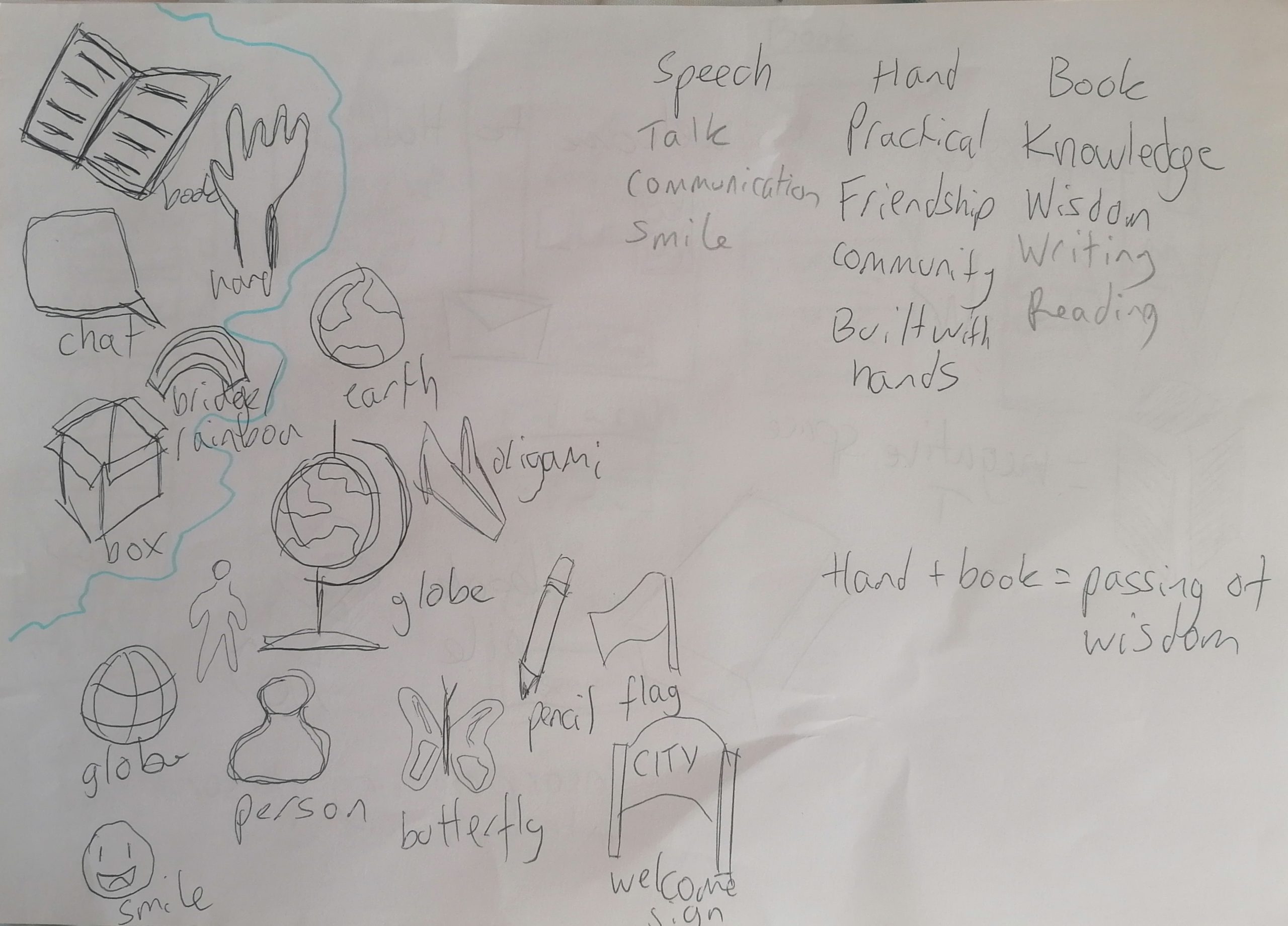
The first challenge that I have encountered was with trying to re-establish a new brand identity for Welcome to English. Although the main idea that I had for the brand was for it to be friendly, vibrant and lively, it was difficult for me to present it in a way that does not feel immature. Despite this, I have still stuck with this image for the brand as I believe it is fitting however I have attempted different unifying ideas behind the art direction, an example of this being that it is based on paper and paper-based design and activities.
Another problem that I encountered was trying to decide on a logo – no matter what I changed, nothing fit the vision that I was trying to create. Also, another problem that I had was trying to create a logo that was fully legible even when scaled down. One way in which I tried to solve this problem is by going to the beginning and sketching out the core ideals and motifs behind the branding of Welcome to English. In the end, I have decided to go with a simple logo.
From the beginning, I have wanted to create a dynamic and unusually laid out website for Welcome to English because I felt it would showcase the liveliness behind this organsation’s story rather than having a very straight-forward, static website. In this case, the problem arises with striking the balance between the website being functional and still trying to provide a memorable storytelling experience.
I have been struggling with the colour palette and I have only developed one at a slightly later stage than I should have at. This has caused problems when developing the website wireframes and mock-up versions because it made it more difficult to visualize the brand overall. The reason why I had this problem is because it felt intimidating to select one colour palette for the entire campaign, since if I selected a colour palette I thought was not fitting later, it would cause immense problems in the last stage of development.
Another mistake that I have committed when planning the way that the website would look on mobile first is that I have made it look too much like an app and did not consider the fact that an app-like layout for a web browser page would cause many issues such as lag and overuse of resources.
One small problem I encountered with Figma is that I created an auto-layout of the top bar without adding the logo first because I was not done designing it at that point. Adding the logo to the top bar proved to be a challenge because I kept changing the logo as I wasn’t satisfied with it no matter how much I changed it. I also struggled with making it suitable for different applications such as an extremely small icon for a mobile app, due to the fact that most of the logo ideas I had were rather detailed.
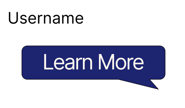
Whilst experimenting with different design elements to add to the website to make it more unique, I have tried to make the box around the call-to-action resemble a speech bubble. The reasoning behind this choice was to make it seem like the website is talking with the user, linking back to the core idea behind the branding – communication. However, I did not end up using this as it is confusing and does not look like an element that is meant to be clicked, therefore breaking the Jakob’s Law. I don’t intend to break this design rule for this website as it would make it non-functional due to the fact that one of my main target audiences don’t speak English, therefore these unconventional elements would cause issues since there is no continuity with any other website that follows the standard design rules.
4. Feedback and integration
One feedback that I have received on the logo options is to consider adding elements of the Jack Union flag to make it immediately recognisable to the average person. One reason why I was and still slightly am hesitant to include the flag is that the symbol might not fit and look slightly strange. One way in which I have integrated this feedback is through experimenting with the already existing colour scheme and potentially trying to incorporate some of the smaller shapes of the flag.
Another feedback that I received was concerning the interactivity cues on the website. The professor has told me that the website might be improved if there were some indications to the users that the elements have interactivity to them via making one tab smaller than the others to encourage scrolling, for example.
The third piece of feedback that I received was from my friend who pointed out that the navigation bar for the mobile website could be further adjusted to make it better and more accessible. They pointed out that the navigation bar would look better if there was text underneath the icons, so that the user could have context on the English word for each part of the website (if they do not know many English words).
5. Sustainable & ethical practices
Accessibility
Accessibility is something that should be implemented from the beginning of a website design project, therefore I considered any accessibility concerns early on, in the planning stage as well as making sure to go back and check that everything I’m working on complies with the accessibility standards. I will be comparing each situation that a person might be in, whether a permament disability or temporary and I will try to accomodate it. For example, I will be running the website through the colour blindness scanner as I design it.
Ethical design
In order to ensure that a website design is fully ethical, the designer must not add any dark patterns of persuasion such as tricking a user into doing something they would not usually want. Another ethical issue regarding design that is important to remember is the human needs and wants, as they override the importance of the website being a successful design. One way in which I am planning to incorporate ethical design into my work is through adding transparency for elements that can cause ethical issues, such as privacy tracking. In order to circumvent this issue, I would add a cookies pop up which lets the user allow or deny consent for data tracking.
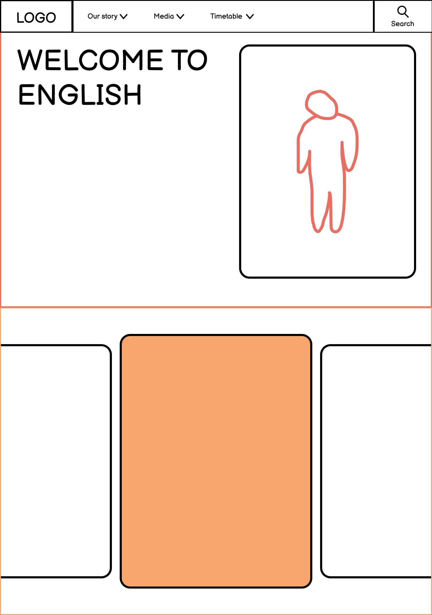
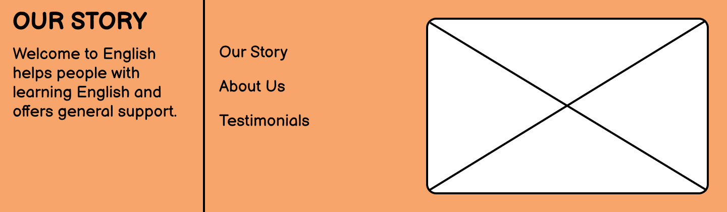
6. Wireframes
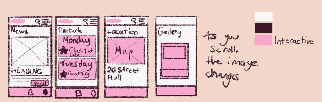
The low-fidelity wireframe has been sketched on paper becuase it allowed for more freedom compared to making it on Figma from scratch at the beginning. I have created only a few screens as I wanted to capture the essential features for the website, and how the overall layout would look. I have made these really simple as they are only low-fidelity however I tried to capture the vision that I am imagining for the website.
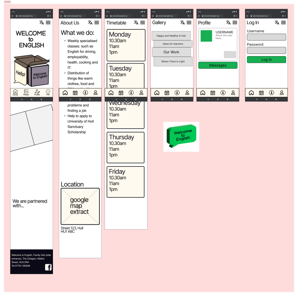
When it comes to the mid-fidelity wireframes, I have tried to focus on the foundation and layout of the website by applying the auto-layout feature to most of the elements. I have done this because it allows for the designer to decide the spacing in between the text and images, for example.
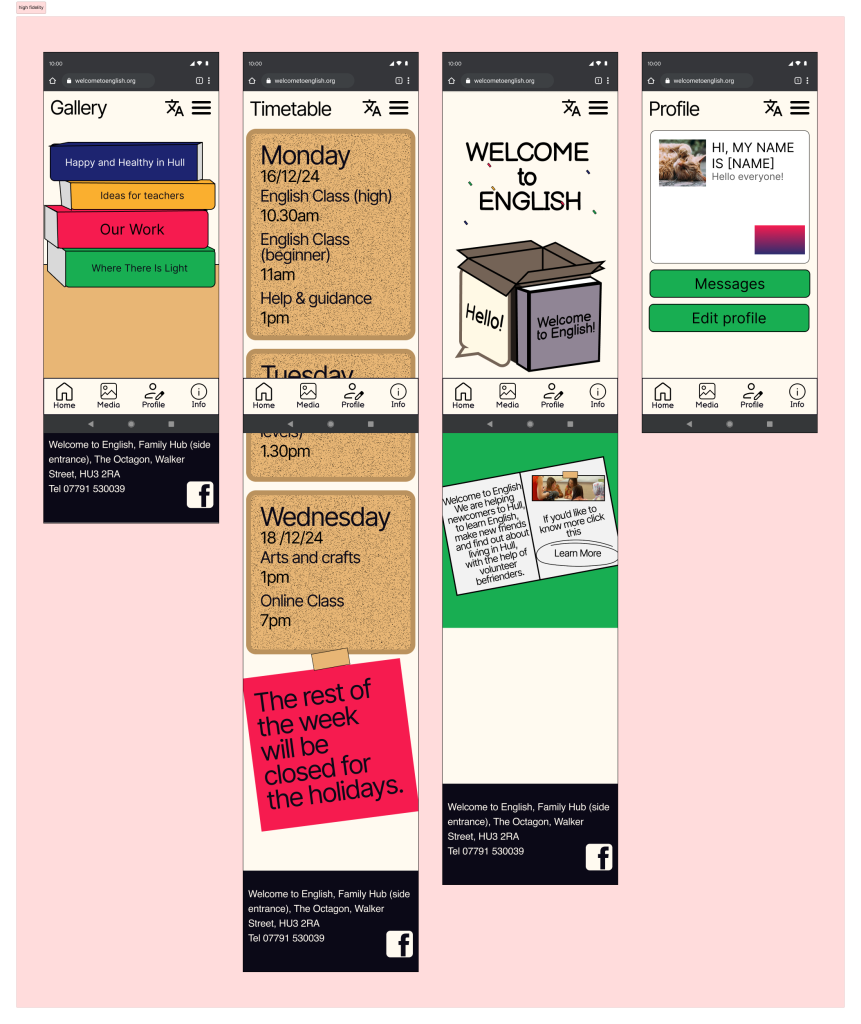
When it comes to the high fidelity wireframes, I have applied some small details as well as the colour palette in order to bring the design to life. During this stage, I focused on the smaller details which add importance to the website, such as the social media logos which allow visitors to connect with the NPO on a social media platform. I have added the paper-based and book-based design choices which I have discussed earlier as I stuck with this idea since I thought that it was e most fitting out of the other experiments that I have done. One small detail that I have changed is how the call-to-action looks – I have made it into text with a highlighter circle around it to fit within the context more seamlessly.
As for the desktop version of the wireframe, I have adjusted the frames from the mobile wireframes in order to fit the format of a computer screen. This is where responsive design became very helpful because it enabled me to bring the small screen design to a large monitor without it looking awkwardly spaced and unbalanced.
Marketing campaign
Although I do not delve into the creation of the campaign during this section of the project, I have started to create some plans and sketches in order to ensure continuity in between the web presence and all of the other channels in the omni-channel marketing strategy. Therefore I have included some elements which are connected to the others which will be a part of the overall campaign so that the users do not feel confusion when interacting with multiple channels consecutively. An example of this would be adding the monthly theme feature at the same time as creating other pieces for the campaign in order to preserve continuity.
References
Welcome to English (2024) Welcome to English. Available online: https://www.welcometoenglish.org// [Accessed 7/12/2024].
Duck English (2024) Duck English. Available online: https://duck.school/ [Accessed 7/12/2024].
Korolyov, A. (2017). Progressive enhancement vs graceful degradation. Which path to follow? eCommerce Development Company. Available at: https://www.mavenecommerce.com/2017/10/31/progressive-enhancement-vs-graceful-degradation/ [Accessed 18/12/2024].
Leave a Reply