Conceptual design is the practice of combining two separate visual ideas into one, creating a brand new idea that will become memorable. It is very commonly incorporated into logos to encapture and communicate the personality of a brand to audiences.
Good example
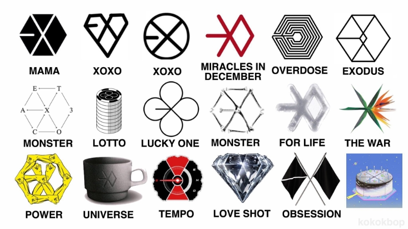
EXO is a Korean-Chinese boy group which currently has nine members (originally there were twelve members). This group has a reoccuring storyline which is not only limited to the music, but also extends to the logo design, choreography, and more. Every member of this group was assigned a different ‘superpower’ and there is a common theme of them fighting an enemy across their discography.
EXO has a large variety of logos that represent the different albums and their respective themes. One element that all these logos have in common is that the letters ‘EXO’ can be found in all of them despite each design having drastically different themes. EXO is meant to be a shorter version of the term ‘exoplanet’, since their concept revolves around them arriving on earth from outer space. As an example, the logo for ‘Overdose’ forms a pentagonal shape with a labyrinth-like pattern inside of it fits the styles and themes present in the music.
An example of conceptual design being implemented into the logo is during their “Lucky One” era where their logo takes on a four-clover leaf shape, obviously using the plant as a symbol of good luck. For the repackaged version of this album, the four-leafed clover is placed on top of casino tokens due to the fact that the theme for the newer song (“Lotto”) is gambling. Furthermore, their later album (“Obsession”) contains a logo portraying two black flags crossing each other, representing rivalry between oneself and their alter-ego, which is the theme present in the title track of this album. The two-flag design also contains the three letter acronym, EXO, thus making it a conceptual design as it combines multiple ideas. The reason why these designs are successful and memorable even to those who are not fans, is that it is unconventional in the way it contains the information needed for an album cover (the group name and the album title).
According to Airey (2010), simplicity can improve the versatility of a design due to the fact that it can be re-used across different media and contexts. This can allow for flexibility when it comes to exploring new styles and themes in the music itself so that it can be portrayed correctly. In EXO’s case, the simplicity of the three letter name enabled them to further experiment with different conceptual designs and shapes due to the versatility of the word.
Poor example
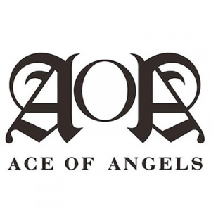
AOA was an eight-membered girl group that was beknown for their classy style of music. They oftentimes changed their logo whenever a new album was released, however I have selected their classic, simple logo as it could be stronger with the use of conceptual design.
AOA, short for Ace of Angels, was selected for the example of poor usage of conceptual design because it simply doesn’t use it. This logo uses the Old English font for both the A letters to signify the elegant style that this group is known for. The O in between resembles a halo, calling back to the original meaning of the acronym, and it is being guarded by two A’s, one of them reversed in order to possibly create an illusion of wings. In the redesigned version, I have tried to make the conceptual design more obvious. Due to the fact that the term ‘ace’ is linked to cards, I have emulated the illustration style of playing cards as well as limiting my colour palette to black and white.

In order to keep the essence of the original design, I have used some elements from the Old English font letter ‘A’ and applied it to the ace drawing to create an illusion of the letter ‘A’. The ace has an angel wing on the side, representing the latter part of ‘Ace of Angels’. In between the feathers of the angel wing, I have included a lower-case letter ‘a’ to conclude the acronym of this group. I have used both upper-case and lower-case ‘A’ becuase I wanted to present the two sides of this group – confident and fierce, as well as sweet and sentimental. The ace has a halo above its head, representing its status as an angel, and incorporating the ‘O’ of the group name. I have rotated the logo slightly to create an effect of movement, which is supposed to portray the energetic nature of AOA’s music. Through this re-design, I have attempted to capture the personality and image of the group, which I feel is incredibly important for idol groups so that they can stand out in a competitive market.
Harvard References
Ace of angels logo. (2022) Available at: https://1000logos.net/aoa-logo/ [Accessed: 4/11/2023]
Airey, D. (2010) Logo design love: a guide to creating iconic brand identities. Berkeley: New Riders.
EXO logos. (2021) Available at: https://www.allkpop.com/article/2021/04/fans-praise-exos-creative-comeback-logo-showing-a-cake-to-celebrate-their-ninth-anniversary [Accessed: 4/11/2023]
Leave a Reply