1. Early Design Prototyping
Mood boards
Eco Future

After looking at competitor websites, I have noticed that most green energy companies have websites that look quite corporate and cold. Some common elements found across these websites include: an animated statistic widget, imagery focusing on nature and green energy, simple illustrations to accentuate the statistics, and very simple layouts without much experimentation. The purpose of most of these websites is to present the green energy services to other businesses, as well as individual clients who might want to use their app to monitor energy, or to use other services they provide like for example installing solar energy panels.
InfluentHull

Many style consultancy businesses share commonalities with each other – elegant serif fonts, minimalistic branding, white or off-white backgrounds with black text as well as rigid layouts. When compiling images for this mood board, I have tried to capture the elegant essence that these websites exude – I have selected a few serif fonts, as well as some brutalist fonts due to the fact that
Cab-E Online (changed to Noctaxi)

This mood board compiles different visual styles in order for me to capture the style that I am envisioning for my taxi app. Firstly, I have selected a colour palette as that is the most important part of the branding – I chose these colours for a reason. The yellow is commonly associated with taxis and it is bold and joyous; the hot pink is meant to add a hint of sympathy; the dark blue represents the night and reliability. In addition, I have looked at some logos in order to be able to envision where I want this branding to go.
Many taxi company websites look poorly made and not secure – the reason behind this could be that many taxi companies are local and are not willing to spend most of their budget on improving their websites, therefore they end up looking insecure design-wise. On the other hand, when it comes to well-designed online taxi services, most of them focus on making their service look safe and trust-worthy, as potential customers might assume badly designed apps and websites indicate that the company is malintentioned.
Competitors


In addition, I have analysed some taxi apps and selected both the internationally well-known ones (such as Uber and Lyft) as well as some that are local to certain areas. After further inspection, most of these apps share common functions, however the ones with the higher budget usually include extra features that can generate more income for them, such as gifts and food delivery.
1.5. Further Research
After conducting research on all three distinct types of companies, I have decided to continue further with Cab-E Online. Therefore, the next stage of research includes establishing what target audience would typically be the customer base of Cab-E Online, as well as investigating what their needs and user journey would look like.
The target audience of this brand mostly consists of young adults who do not own a car or a driving license, however they have some disposable income to spend on using a taxi as their preferred type of transportation.
I have decided to change the name of the company from Cab-E Online to Noctaxi because I felt that it would be more fitting to the image and purpose of the brand. The ‘noc’ in Noctaxi is short for ‘nocturnal’, as I have decided to make the brand centered around safe taxi transportation at night and late hours.
When it comes to the branding of Noctaxi, I have selected some visual elements that will bring balance between the different formats of promotion and the app design. One of the design elements is the threshold filter being present initially but then disappearing slightly (this will mostly apply to the video advertisements) – the reasoning behind this is that the threshold filter creates a sense of a monochrome and rigid style as it is meant to represent being stuck outside of your home at night and looking for a possible solution.
2. Logo
Early sketches & references

The first step of designing a logo for Noctaxi was trying to combine the two elements: night-time and local taxis. The first thing that was in this process was sketching small images related to these topics in order to envision how they could be combined alongside the text. I have also sketched out the text and how I could add the small images to it in order to add meaning. In the end, I have decided for the logo to be more text-based than image-based, as I want the name to be seen easily.

The first logo that I have created for Noctaxi included the Weltron Special Powers font as I felt that it was appropriate for the mood of the brand – it is a bold and playful font with a thick outline. The first action that I took in order to customize it was creating two layers of colour at the bottom of the letters in order to signify the stripes on a taxi as well as the sky changing from daylight to night.
The second logo that I created uses a different variation of the Weltron Special Powers font, this version does not have the drop shadow effect that the first one does. In order to customize the font further to portray the company’s message clearly, I have added a negative space image of a bird’s eye view of the taxi. This shape gains additional meaning when some of its details are removed, as it creates a moon shape, therefore creating a double meaning that links to the purpose that Noctaxi provides.
The third logo that I created utilized the Eight Track font and used the colour palette that I previously selected. The reason behind this design choice is that the font feels whimsical and fitting to the night-time theme. Also, the tittle above the letter ‘i’ caught my attention as something that could add a form of playfulness, which is what I was searching for in a font.
3. Wireframe Prototyping
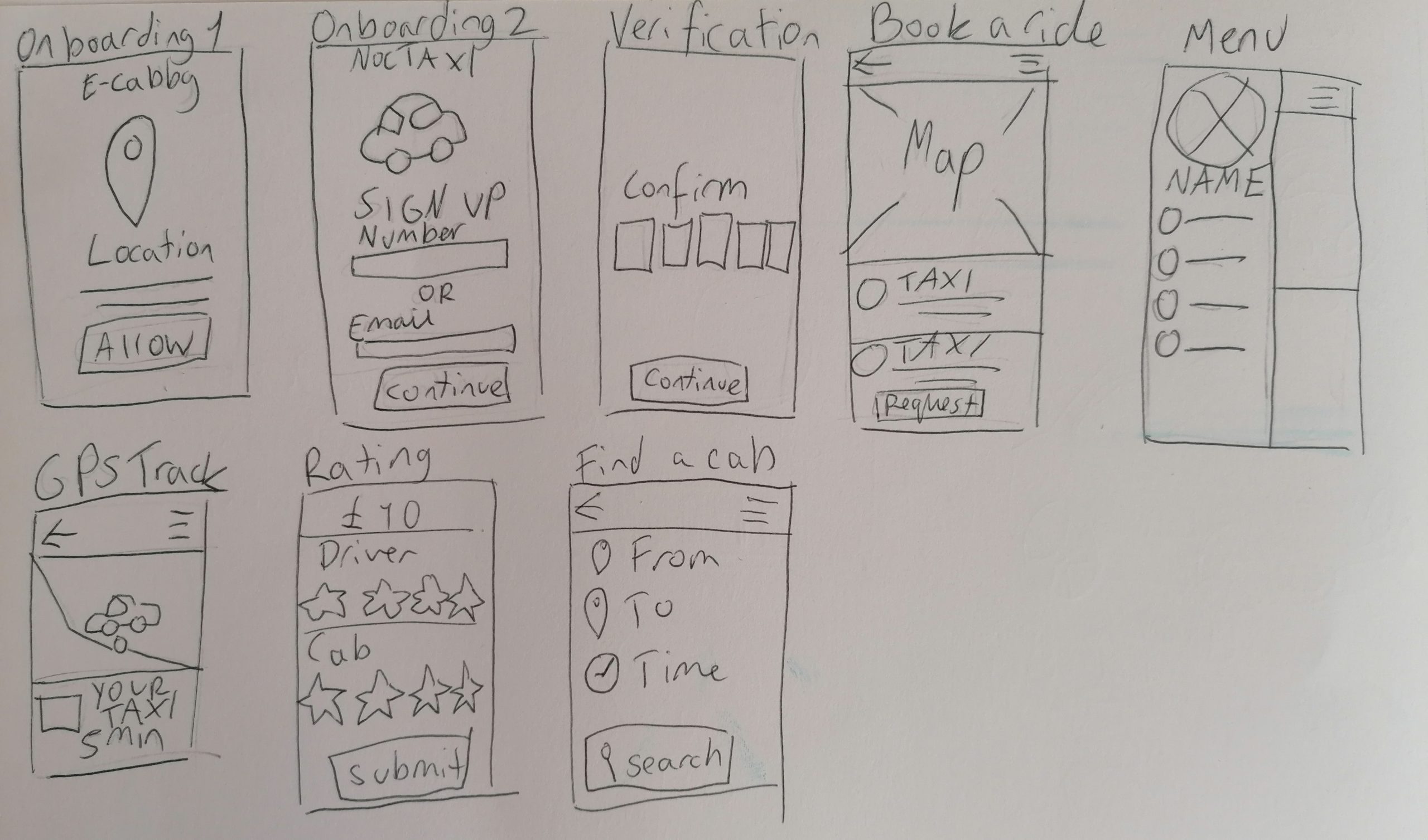
The first step of prototyping the website was creating a list of features and pages that this taxi app would have and then applying them to the hierarchal task analysis, categorising them based on importance and user needs. This is where the previous research and analysis of competitors helped out greatly because it presented the user needs in a practical scenario where real people use the app therefore the designer behind it had to optimize it to fit their target audience (but sometimes they failed at that).
When it comes to the mid fidelity wireframes that I created for Noctaxi, I have tried to focus on the functions of the app over the style and look in order to make sure that it logically works as an app with purpose. I have implemented some of the core features such as the map and location tracking by emulating them through Figma plugins. In addition, I have tried to put focus on information hierarchy and proper layout during the mid-fidelity stage as without them, the entire design would fall flat. I have applied the standard mobile grid system of 4 columns with a margin of 20pt.
Later on, I have decided to change the default colour palette of the app from light mode to dark mode because for many people, a bright white background on a screen would be uncomfortable on the eyes (especially at night). In conclusion, the dark mode ended up complimenting the existing colour scheme in a strong manner – the bright accents of colours have more life against the dark background.
A small detail that I have added in the high quality version of the wireframe is a loading screen which presents the logo alongside the moon changing cyclically. The reason for why I have included this is that I wanted the moon motif to be present in multiple branding and promotional materials. Also, the moon changing further links back to the idea of the user accessing this app at anytime of the night, month or year (therefore the moon changes).
4. Banners
Wide Skyscraper
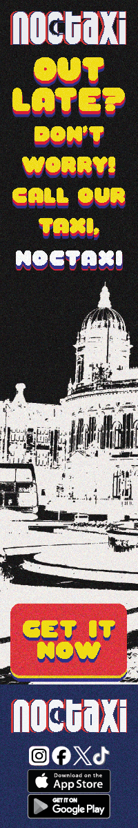
The last advertising banner is in a skyscraper format, therefore more information needs to be formatted in a narrow area, which was slightly difficult without compromising the quality of the images. I have also applied the branding elements of Noctaxi to this banner as I wanted to keep it consistent. One different element that I applied is the photograph of the Hull City Centre as the background. The reason behind this decision is that
Rectangle Banner
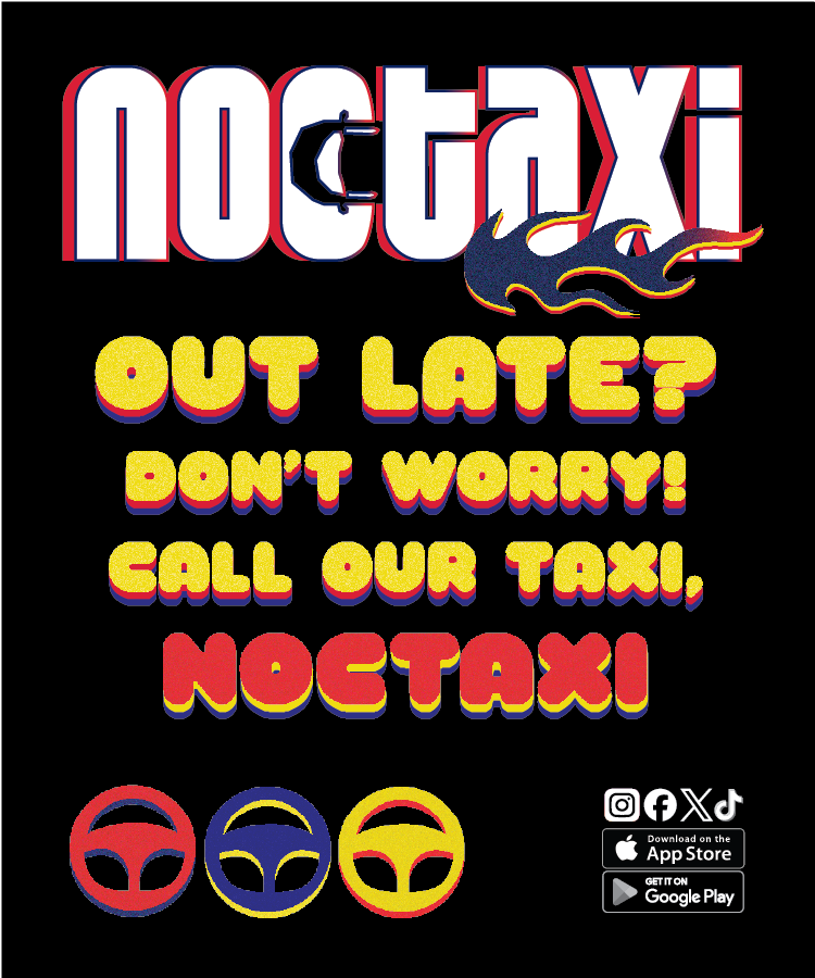
This mobile, square banner differentiates itself from the previous one whilst still abiding to the graphical standards that I have set previously for Noctaxi. For this banner, I have decided to use the colour palette alongside a dark background. The reason why I have made this banner different in this way is because I wanted to present a different facet of this taxi service – the banner with a bright white background would be more eye-catching in the dark, targeting peope’s attention in the moment where the app could be useful to them. This banner however is meant to be perceived during the day, where the potential customer might consider downloading the app and using it later when it is needed.
I have had to adjust the text, the central part of the banner, multiple times as it can be ineffective at communicating its message if the text is presented without care. At first, I have made the text fully yellow and equally scaled. I have however changed it because it was a slight eyesore and it looked unbalanced. After looking at how other advert banners balance their information, I have concluded that the solution to this would be to change the size of the question at the top and to add a shadow to the text.
Mobile Banner
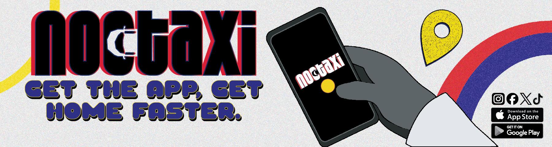
This advertising banner is meant to present the app to the potential users whose needs might be met after downloading the Noctaxi app. I have used the set colour palette alongside a monochromatic illustration of someone holding a phone in order to keep all of the imagery consistent with Noctaxi’s branding. The person holding the phone is waiting for the Noctaxi app to open up as they are in need of a late night taxi to pick them up safely, signalling to others in that situation that they can get the app if they want to get home quickly. As for the tagline, “get the app, get home faster”, I have used the Yeyeye font as I felt that it contrasted the angular style of the logo font and portrayed the fun and playful style that this taxi company is trying to achieve. I have added the arches around the top left and bottom right corners in order to signify the moon motive more subtly whilst also adding a sense of motion to the poster.
5. Online Video Advertising
Before creating the video advertisements, I have created a plan and a hook for the videos that will capture the viewer’s attention. One way in which to create a strong hook for a video advertising a service is to grab the audience’s attention and convince them to give the app a chance. The plan for the first video advertisement was showing the audience that no matter if they are returning from an airport; or returning from a late shift at work, or coming back from a party that stretched to the early hours, that Noctaxi can help them get home safely relatively quickly. The plan for the second video advertisement was to make it more vector-based and implement the ranging elements such as the logo in order to familiarize the audience with the company. For this video, I would present the features and appeal of the app in a format that is similar to the banner advertisements because it will create cohesion with the branding overall.
I have applied the noise filter to the footage because I wanted to emulate the slightly dim, sparkling feeling that your eyes can get when trying to look at something in the dark. In addition, I also thought that this effect made the text, logo and vector elements stand out more due to the fact that they contrast each other.
References
Gett (2024) Gett – The taxi app (Version 10.37.72) [Mobile app]. [Accessed 2/1/2025].
BlaBlaCar (2025) BlaBlaCar (Version 5.189.0) [Mobile app]. [Accessed 2/1/2025].
Suol Innovations Ltd. (2025) inDrive (Version 5.189.0) [Mobile app]. [Accessed 2/1/2025].
Infinite Cab (2025) Passenger app. Available online: https://infinitecab.com/passenger-app/ [Accessed 2/1/2025].
Infinite Cab (2025) Top 10 features of taxi software. Available online: https://infinitecab.com/passenger-app/ [Accessed 2/1/2025].
43 Clicks North. (2024) Fountain near brown concrete building under blue sky. [Photograph]. Available online: https://www.pexels.com/photo/fountain-near-brown-concrete-building-under-blue-sky-5321472/ [Accessed 2/1/2025].
Morina, G. (2024) Low angle footage of the wet pavement of the sidewalk with a signage on a rainy night in the city. [Photograph] Available online: https://www.pexels.com/video/low-angel-footage-of-the-wet-pavement-of-the-sidewalk-with-a-signage-on-a-rainy-night-in-the-city-3037170/ [Accessed 2/1/2025].
Cottonbro Studio. (2024) A person is driving a car with their hands on the steering wheel. [Photograph]. Available online: https://www.pexels.com/video/a-person-is-driving-a-car-with-their-hand-on-the-steering-wheel-4607441/ [Accessed 2/1/2025].
Leave a Reply