The purpose of these information entails: providing the audience with the lyrics for the songs as well as illustrations to give further context; as well as website pages which are meant for promoting the music group that Synesthemusic has under their company.
WEBSITE
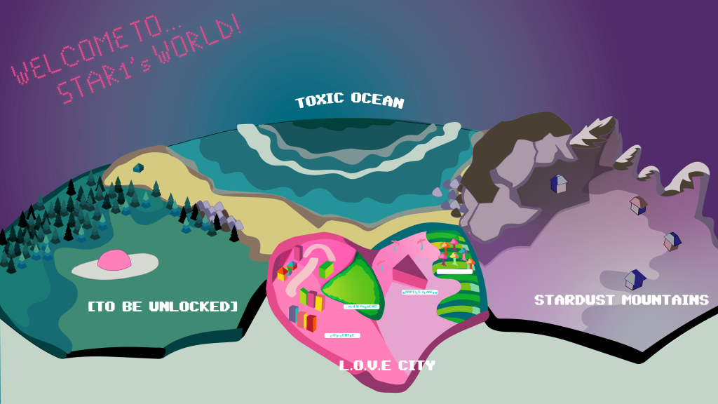
The information pages for this project take two forms: a promotional website and the lyric booklet inside of the main product (album cover). The website portion is meant to present and contextualize the albums which have recently been released, as well as acting as an archive for information regarding the music group and their works. The first page on the website presents a map of the fictional world that the albums revolve around. The function of this page is that when a user clicks on a region, it will link them to the album that it is present in. I have decided to illustrate this map with a cell-shaded, vector style in order for the quality of the image to be preserved even when the size of it is adjusted, and to match the same style that was present in the character portraits and the album designs.
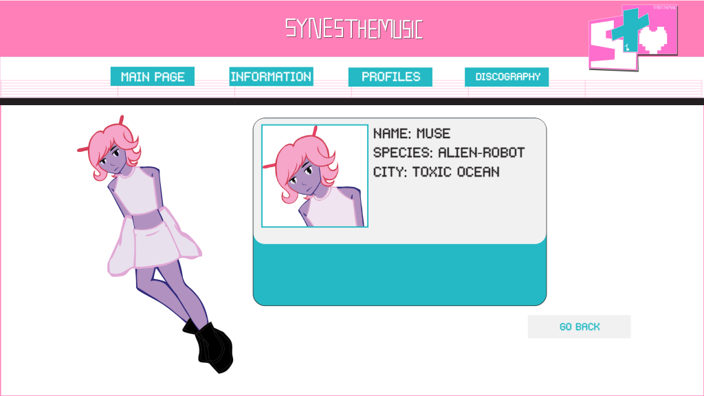
The second part of the website which can be selected from the top menu, is meant to act as a profile for the characters and the context behind them. The format of this page resembles an identification card, as well as a full body shot of the character so that their outfit can be seen clearly. This can encourage the audience to create transformative works about these characters, therefore fulfilling the creative cycle and its own purpose. Due to this project being centred around combining different media for storytelling purposes, the profile pages would also have facts about the music written on them depending on which song is being promoted at the time to cultivate a potential fanbase, and to spark theories being made by fans and how they interpret those characters based on the visual information that is there.
LYRIC BOOKLETS
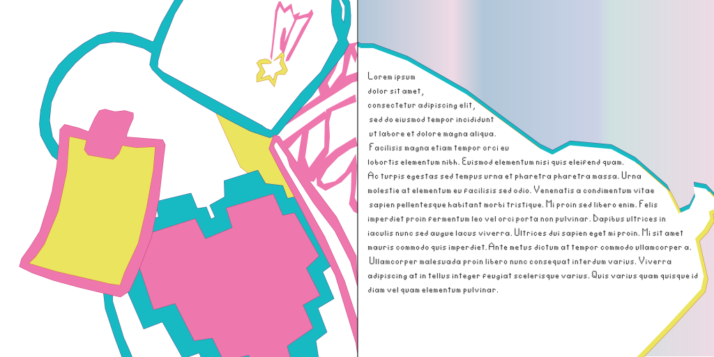
When it comes to the other type of information pages that I have created for this project, they are supposed to be the lyric booklets which are usually found inside of an album. The first lyric booklet I have created is for “Signal Lost” and its main image is a colourful, slightly futuristic shoe placed in an angled manner – the reason why I have chosen to do this is to show a piece of clothing (an identity signifier) as a symbol of being in the middle of a journey. I have reused the same style as on the front cover in order for the entire design to be coherent together. I have ensured that the lyrics are legible whilst still being incorporated as an active design element to create visual interest.

The second lyric booklet that I have created is for the second album in the series, “The pink screen of death”, and this time it presents a match being lit in order to signify a sense of danger that the characters find themselves in in this album, as well as being a visual callback to the Western cowboy style which is a present theme as well as the space theme. I have tried to keep this style consistently by making the designs simpler as a reference to the futuristic style, which often utilizes smoother textures.