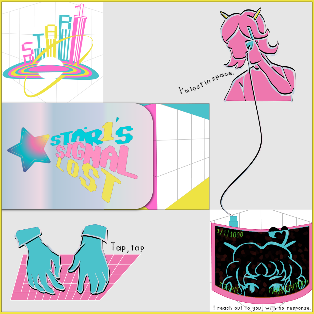
The first album, titled “Signal Lost” explores a playful, futuristic style and contains songs primarily of the electropop genre as well as featuring a linear storyline told through the sound and lyrics of the songs featured. The colour palette that represents this album is pink, blue, yellow, and white – these colours are meant to highlight the liveliness of the tracks and the characters. The layout of this album is a three-by-three square grid, which is meant to hold resemblance to a Rubik’s cube, and also to present the gaps of knowledge about their world since they are new to their world and are still exploring – this is the reason why there are gaps.
One major change that has been done in terms of the approach to designing this cover is that I have decided to make the main colours (pink, blue, yellow) accent colours instead of being the main focus. This is because I believe that it is more impactful when done sparingly. One special feature of this album is that it contains wires connecting some of the images: this is meant to symbolize the loss of ‘signal’ (communication) between characters, which is the central theme of this record. This album cover would have a shiny and glossy texture to it in order to represent the texture that would be found in the songs themselves.
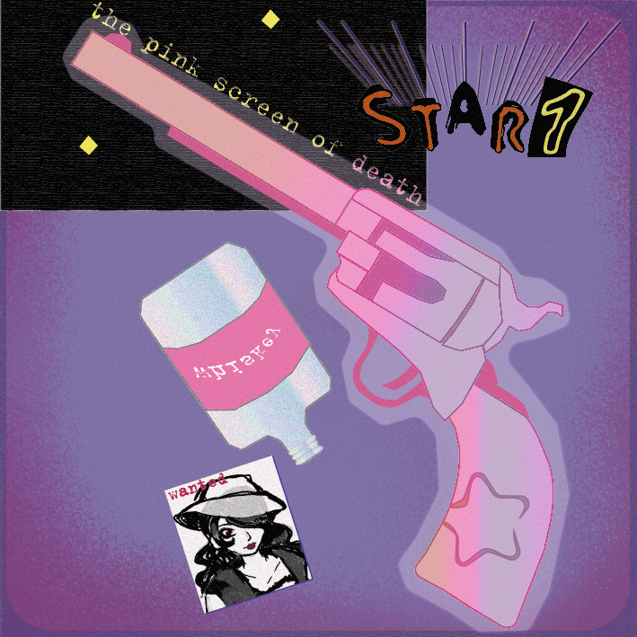
The second album, which is titled “The pink screen of death”, follows a storyline set in a western sci-fi scenery. The genre and atmosphere of this album leans towards a more moody, melancholic and mature sound compared to the previous record in this installment. The main artwork still follows the same layout however this time it presents a pistol as its main object. This is due to the fact that it is a storytelling device in this case – the main characters have to fight the antagonist, therefore they prepare by taking this gun with them on their journey. The colour palette this time utilizes slightly darker and richer tones in order to communicate the sound of the music itself, as well as presenting the style associated with the Stardust Mountains region. An effect that I have tried to achieve is to make this album cover have a slightly dusty and rough texture – this links it back to the original idea of interconnecting different sensory experiences.
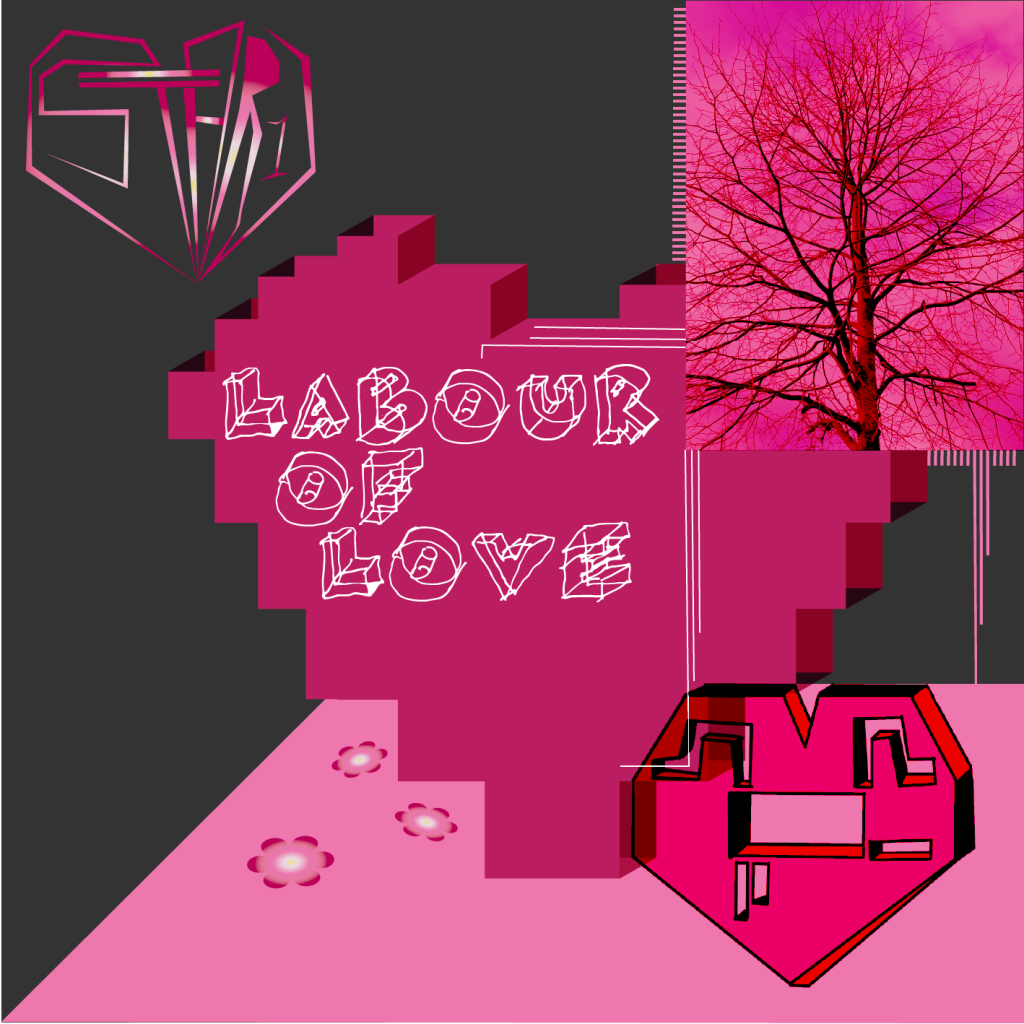
The third and final album, titled “Labour of Love” presents a romantic outlook on life, and focuses on themes of love and life. Due to these themes, I have decided to portray them using different objects, such as the computer chips, tree branches and flower petals: those are supposed to symbolize the fact that despite the characters being robots and artificially built, they can still express feeling alive and feeling connection to other robots in their community. This time, I have decided that the base background colour should be black because I was trying to make an association of finding positiveness in hopeless circumstances. The main and most important imagery of this album is the computer chip heart, as it connects to the storyline of these robots and how they communicate with each other.