Composition is the art of arranging different elements or grids to convey a message through the way the hierarchy of information was arranged. A composition that lacks quality can damage the legibility of a design, therefore making it useless for the purpose it is meant to serve.
Good example
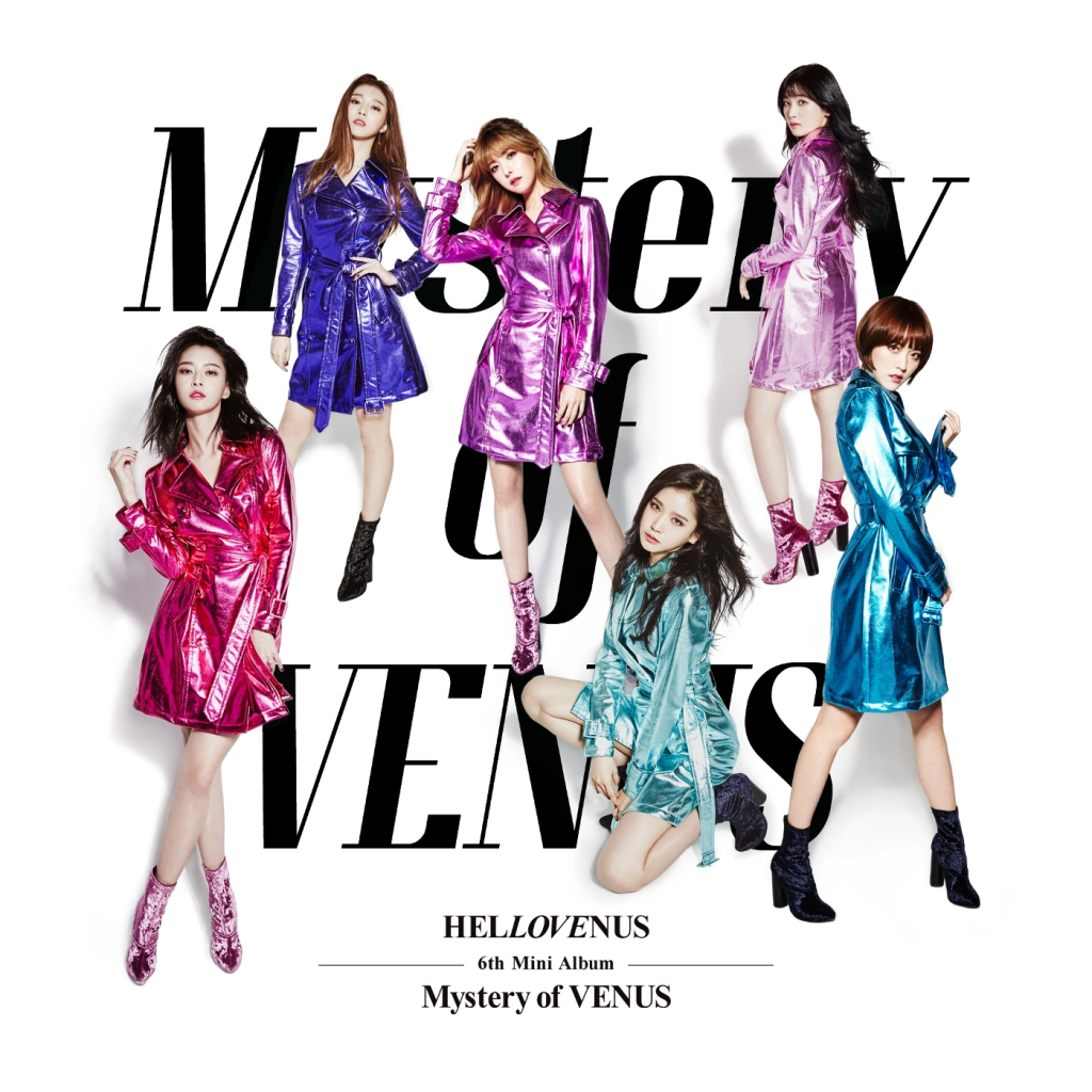
Hello Venus is a pop girl group that debuted in 2012 with six members. The signature style of Hello Venus is elegant and mature, and it is notably present in ‘Mystery of Venus’.
‘Mystery of Venus‘ by Hello Venus presents a unique take on the full body photo trope found commonly in album covers. Although the typography and background could be interpreted as simple, it is fitting for the classic style it is attempting and does not feel overwhelming. This cover avoids the idea of having every person stand in a horizontal line, and instead tries to interconnect the photographs with the text that is placed beneath. Every person striking a different pose is what makes it dynamic because each of them create different lines of movement, as well as varying amounts of negative space. It can be inferred that with the way that the band members are posing and positioned on the page, they are forming an ‘M’ shape, possibly representing the first initial of the album title. In addition, the letter ‘M’ creates a strong visual contrast and ensures that there are no awkward gaps or unbalanced shapes, since the letter has a zigzag-like form. The colourful attire helps break down the composition into two categories – the white space with typography presenting the tile, and the photographs which bring colour to the monochrome background.
The text writing out ‘Mystery of Venus‘ is in an elegant Serif font, and despite the fact that it is obscured beneath the photos, it is still legible. It is important to keep in mind that typography on an album cover usually holds a lot of significance, and it not being legible can fully stop the design from working the way it is supposed to.
The hierarchy in this album cover is quite unbalanced – the text beneath the main design is scaled down drastically, which creates contrast between the two. The reason behind this design being successful in using composition is that it strikes a mid-point between the classical, monochrome style and a colourful, flashy atmosphere without feeling incohesive and unbalanced.
Poor example

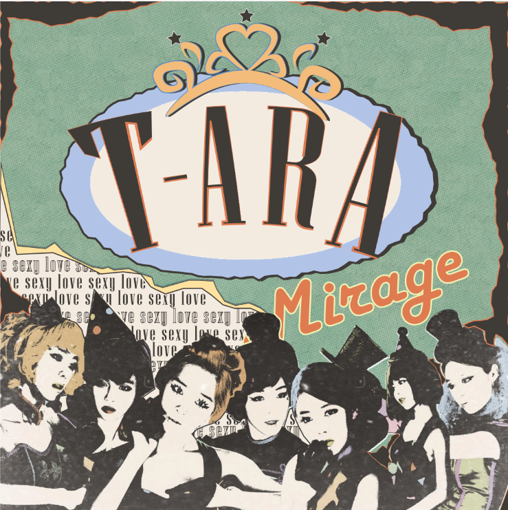
T-ARA is a girl group famous for their catchy songs and combinations between EDM and ballads. They have debuted in 2009. ‘Mirage‘ is a repackaged version of their previous mini album, ‘Day by Day‘. The theme has changed in between albums to a vintage, playful style – in the re-design, I have tried to keep the same essence.
As for the example of composition being presented poorly, I have selected the mini album ‘Mirage‘ by T-ARA. The lack of hierarchy in this design might confuse those who are not already familiarised with this band due to the title of the album title being surrounded with unnecessary text that does not add much value. The lack of balance between each of the elements of this album cover is what is stopping it from having cohesion. In order for it to reach its full potential, it needs to re-arrange its hierarchy and ensure that all elements are harmonious with each other.
In the improved version, I have decided to make the name of the group the most noticeable, since in the original it blends in with the rest of the text and does not consider itself the most important. The second most important element in this hierarchy is the title of the album which is the reason why it has been placed into an uncrowded area of the image. The font choice has been changed due to the fact that it could be made more fitting to the vintage style of the original. The title of the promoted track of this album has been placed behind the photographs of the members, resembling the style of an old newspaper that has been ripped up. This has been done in order to create more variety in terms of the texture included, and to ensure that it is not the first thing the viewer notices as it is not the prioritised part of information. According to Tondreau (2019), including too much data can over-complicate the process of designing, and making each section clear can increase the visual appeal of the composition, which is the reason why I have deleted some text that I deemed unneccessary in the context.
Harvard References
Hello Venus (2017) Mystery of Venus [Audio CD]. Fantagio.
T-ARA (2012) Mirage [Audio CD]. Repackage. Core Contents Media.
Tondreau, B. (2019) Layout essentials: 100 design principles for using grids [eBook]. Beverly: Rockport Publishers.
Leave a Reply