Defining the UX for your Festival
The Pol’and’Rock Festival is annually held during late July or early August. This festival is centered around rock and alternative music concerts, as well as raising funds for a charity under the name “The Great Orchestra of Christmas Charity”. This festival has a free-entry policy, which is one of the many reasons for its massive success in Poland. This festival attracts people from every region of Poland; therefore, it is significant that the needs of the user are met due to the sheer variety and diversity of the audience.
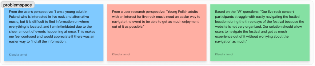
The problem space concerning the website and companion app for a rock music festival should encompass the atmosphere of the festival, considering that most of the appeal lies within the festival’s climate as stated by 30.31% of participants according to a study by Zmudzińska and Matykowski (2023). In addition, the problem space requires the design to put spotlight on a user who wants a website or companion app which will navigate them around the festival location with ease, to ensure that they are getting the most enjoyment out of the festival, and might consider joining the community surrounding this festival.
In order for the festival website and companion app to fulfill its potential, it must consider measures of usability such as: ensuring that all the vital information (e.g. date, location) is instantly accessible; it’s friendly for users who are not experienced with technology, and it is engaging for those seeking out the content regarding this festival. Also, this festival attracts a very wide range of people therefore it is important to try and focus on all of the users to recognise the diversity of human values in User Centered Design (Interaction Design Foundation, 2016).
The problem space differs between the website and the companion app because the user might have different purposes for each – for example, the app might be used for quick navigation due to the convenience of it being on a phone versus the website, which is meant to showcase the information to the stakeholders in a clear manner.
Requirements Gathering and Analysis
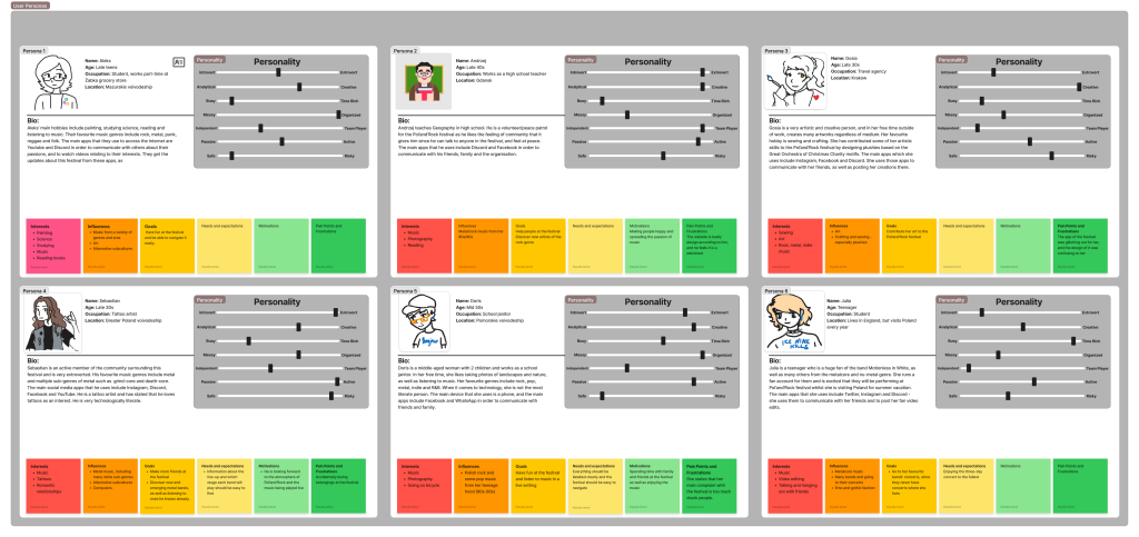
The target audience which is most likely to attend this festival are people who are passionate about music and value the feeling of being in a community rather than independent. Some of the assumptions that the audience may have for this festival is that it exclusively plays rock music or that it is not fully safe for the participants considering the large amounts of people – one method to challenge these perceptions using UX design is to provide the information dispelling these false speculations in an evident manner.
I have conducted a small questionnaire to accurately reflect the style of user who would use this product. Whilst the questionnaire was not the most successful due to the low number of participants, I have noticed a pattern in between these users which allowed me to create these personas so that the problem space for my design matches accurately to their needs.
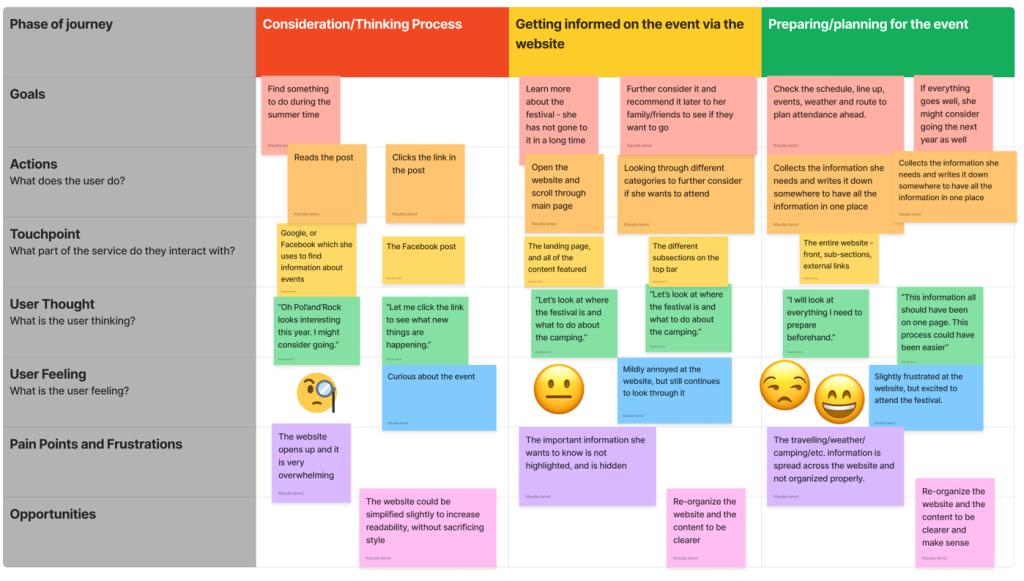
This user journey map follows Doris’ experience with the website of Pol’and’Rock, and how she navigates it. Doris sometimes struggles with technology, however through realizing the problems that she has faced during the visiting of the website, information on how the website could be more accessible and usable is acquired.

The stakeholders for this festival include the Great Orchestra of Christmas Charity, which is the charity behind this entire festival, and most of the profits made from the festival’s sponsors go to the charity. This stakeholder would consider the design to be successful if it portrayed the values of the festival and encouraged people to get involved in charity causes themselves or supported the cause. One way in which this could be portrayed in the design is through emphasizing the link between the festival in the charity and making it very apparent on the website/companion app.
The competitors of Pol’and’Rock festival (website and app-wise) include other music festivals which prioritize alternative and rock music as well as being associated with counter-culture and alternative subcultures. The app that I selected is titled Portola, and it presents usability and good organization in its design, which could inspire the success of the Pol’and’Rock app if it followed the same principles.
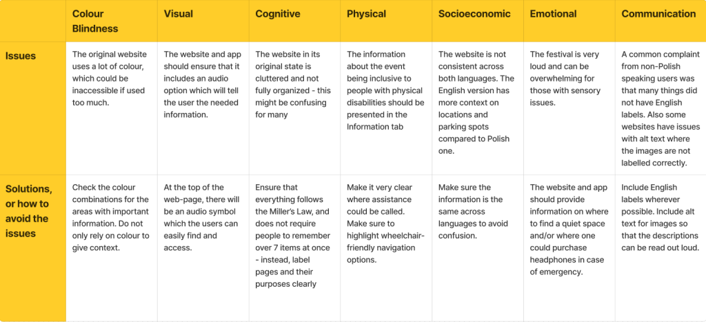
The subject of accessibility is crucially important, as without it a large portion of the audience would be excluded. The main accessibility concerns within the Pol’and’Rock festival design is possible lack of an alt text feature, as well as the design utilizing too many colours which might affect those with colour blindness and other eye conditions.
UI Principles
The design laws which will be applied to the final design of the website and companion app include the Jakob’s Law and Hick’s Law (Yablonski, 2024) – when it comes to the former, it is important to emphasize design features which most users will be the most familiarized with. This would be achieved through keeping consistency to a few web design conventions such as having the main heading of the website at the top in order to make sure that the hierarchy of important information is established.
As for the Hick’s Law, the number of choices present on a website can affect how a user will perceive the festival – if everything is organized, it is an indication of the festival being more trustworthy, design-wise. The original version of the Pol’and’Rock website provides too many options in an unorganized fashion, which is likely to drive potential customers away in favour of other competitors who have a more simplified design.
Call-to-action is essential when it comes to supplying the customer with context on what the next step of the website hierarchy will be. In my design, I will ensure that the call-to-action elements are direct and phrased as a command to avoid unnecessary user confusion which would affect the success of the website.
The design will provide feedback about the actions through keeping consistent web design measures such as a link being highlighted once a user hovers the mouse over it, or a symbol being included to inform the user on what the performed action was. This will potentially remedy the frustration of website elements not having the possibility of interaction, increasing its connection to user centered design.
Rejected Designs
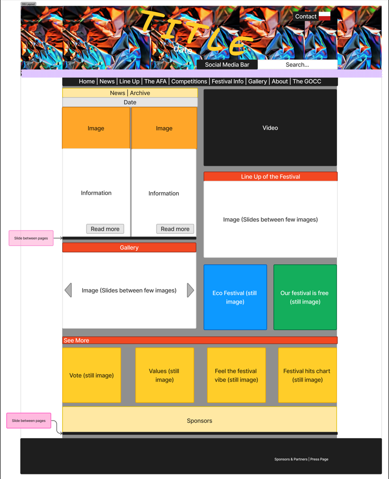
At the beginning, I have decided to analyze the layout of the already existing Pol’and’Rock website. To do this, I have attempted to simplify all of the elements into blocks in order to evaluate the success of the overall design. In summary, the large amount of tasks could be considered overwhelming, forcing the user to spend a longer time making a decision.
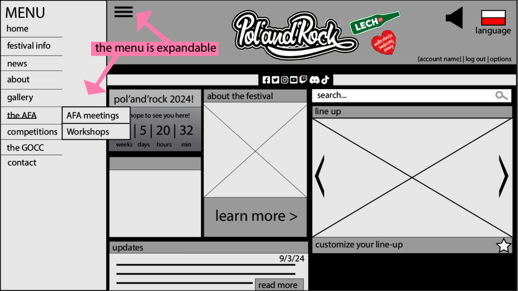
Firstly, I have tried to experiment with the layout of the page to see if it could be made more organized and easier to navigate where the user needs to. This experiment did not become successful because of the fact that the side menu bar is not exactly compatible with the original layout of the Pol’and’Rock website, therefore in order for it to work, it would be essential to re-arrange everything completely and start over from scratch. The reason behind the side menu bar being chosen over it being presented on a horizontal line is that it was intended to be less distracting, but ended up being the opposite.
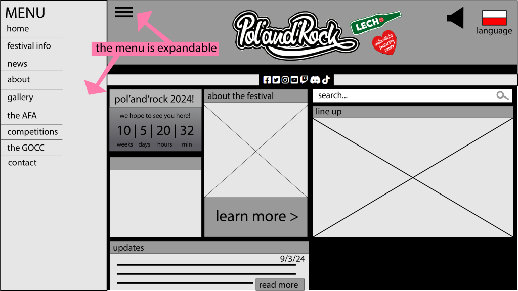
The second design is the previous idea as before, however I have tried to implement it more seamlessly by condensing it into a symbol at the top left of the header so that it can be seen effortlessly by the user. The reason behind it being hidden away behind a menu is to eliminate the frustration of the website being overwhelming and making it difficult for the user to make a quick decision. The reason behind this example being a rejected design is that it would not display the smaller sub-sections when a user would hover over the text, therefore making it an counter-intuitive design and not following the previously established Jakob’s Law.
Low-Fidelity UI Prototype
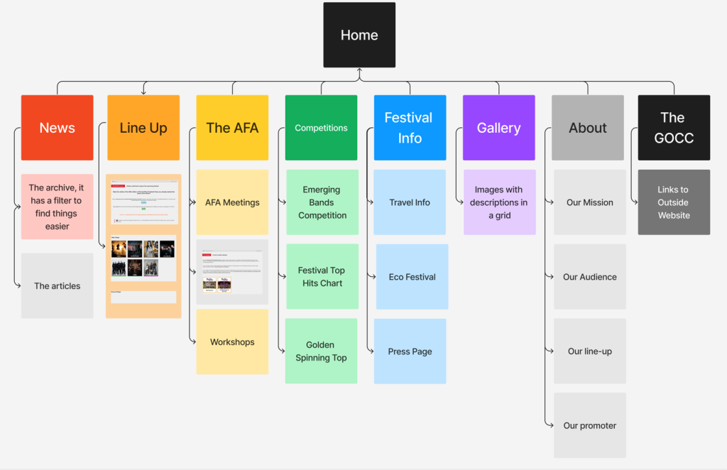
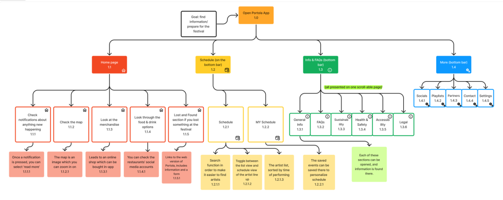
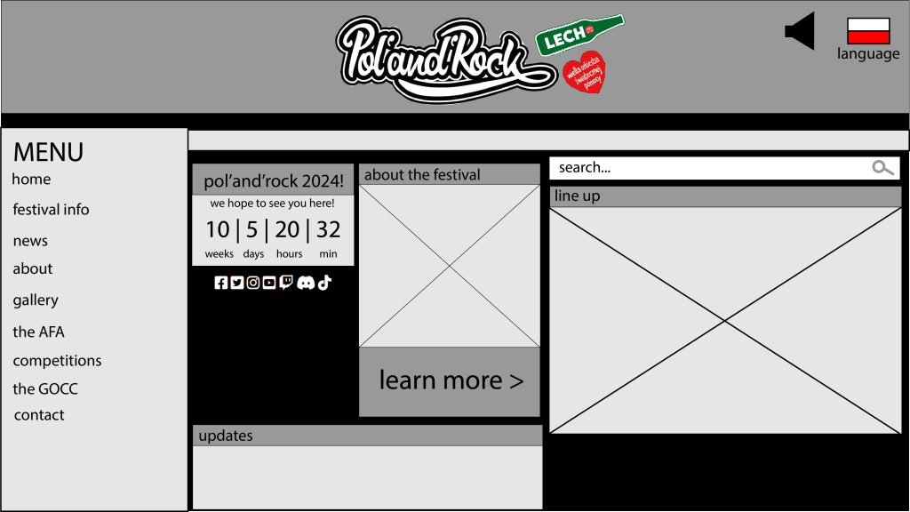
Before designing the wireframe of the website, I have mapped out the HTA of the original Pol’and’Rock website so that the order of the menu could be adjusted in terms of which one would be the most useful to the average user who has not yet joined any community-based element of the Pol’and’Rock festival (such as the Academy of Finest Arts and the competitions). Because the order of the sub-sections confused some users, I changed them, as well as moving the entire menu bar to the left and making it expandable upon the user’s wish.
In addition, I have included some new features to enhance the original website and make it even more useful for the average person who wants to attend. According to ProjectSimply (2021), the top three features which were ranked as the most important were: editable line-ups, schedule makers and on-site ticketing. I have incorporated editable line-ups into my design because Pol’and’Rock utilizes five separate pages therefore it could prove to be useful to a large number of users. Furthermore, I have included the function of having an account so that the line-up and custom schedule can remain even after cookie files are cleared.
In order for the design to guide stakeholders towards avoiding common mistakes, I have attempted to reduce clutter and change the positioning of some of the elements. In the original website, the search function can easily go un-noticed due to the crowded nature of the entire top section, which is why I decided to separate it from the top bar to decrease the number of elements present on top, in hopes of avoiding the stage of indecisiveness. Furthermore, I have made the decision to include a timer for the event to make it easier for the user to visualize the amount of time until the event, as well as building excitement for the festival, increasing its chances of being successful.
Harvard Referencing
Interaction Design Foundation – IxDF (2016) What is user centered design (UCD)? Available online: https://www.interaction-design.org/literature/topics/user-centered-design [Accessed 8/3/2024].
ProjectSimply (2021) Festival Insights Report. Manchester: ProjectSimply. Available online: https://projectsimply.com/assets/Festival-Insights-Reportv8.pdf [Accessed 8/3/2024].
Yablonski, J. (2024) Laws of UX. Available online: https://lawsofux.com/ [Accessed 8/3/2024].
Zmudzińska, K., Matykowski, R. (2023) Spatial and social aspects of the impact of Pol’and’Rock festival and Jarocin festival in Poland. Journal of Geography, Politics and Society, 13(2), 46-66.