Responsive layouts are incredibly important in order to ensure that your product is usable across different platforms. one way this could be achieved is through having a master grid which adjusts when the window is resized. One way in which this can be applied to my own layout is through re-organizing the order of elements on the website so that it can be accessible on the mobile version of the website too. Without responsive layouts, the designs would become unusable therefore it is important to remember the theory that supports the usage of responsive layouts.
In order to keep the elements on the website or design proportional and concise, it is recommended to use the grid system and follow the suggestions for the sizing that each platform has. For example, the desktop screen should be split into 12 columns to make the proportions correct due to the dimensions of an average PC screen. On the other hand, the phone only requires 4 columns as a phone screen is slimmer and needs to present information in a different order like for example re-arranging where ever there is an occurance of side-bars which sometimes have to be adjusted to fit the constraints of a phone screen.
For the purpose of simplifying the process of prototyping in its early and middle stages, I have opted for using vectors as the icons included in the app and website. However, in the high fidelity stage, those icons will be replaced with hand-drawn ones to ensure that there is consistency in style between the text, photography, illustration and boxes. I have selected those placeholder ones due to the fact that they stand out well against the background and have thick lineart, which increases the accessibility of the product due to its elements being more easily viewable.
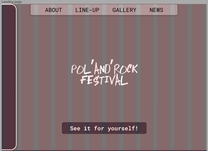
One way in which I have attempted to capture the atmosphere of the Pol’and’Rock festival in my design is through ensuring that there is enough negative space in the mid-fidelity designs to fit any artwork or patterns in small amounts to elevate the aesthetics of the design. In the final design, I will make sure to include photography in order to present to new viewers what this festival has to offer and to increase the appeal of the designs for these products. Also, the colour palette that I have decided on for the website and app is meant to encapsulate the atmosphere that many Pol’and’Rock attendees remember it for – the combination of colours can represent the states of the sky to imply that the festival takes place during the full twenty four hours and there is a wide range of activities to do there. In order for the design to be successful, I think that it should communicate the feeling that the attendees have experienced at the festival through user experience and web design.