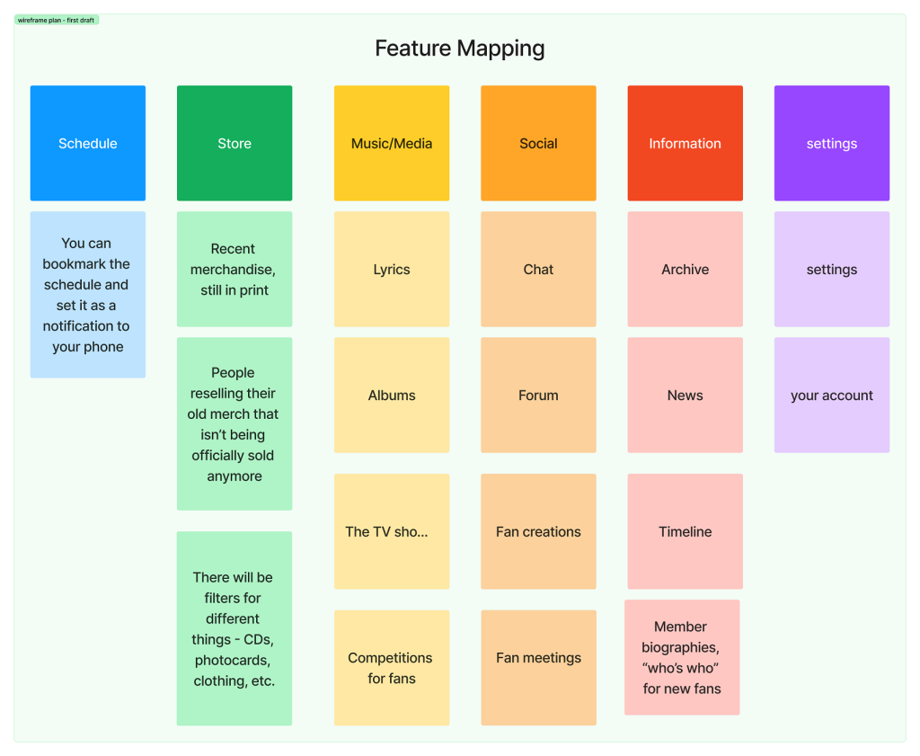
In order to be able to visualize the structure of the app and its primary and secondary functions, I have created a quick draft of ideas for how the features of the app could be distributed into categories. I have decided to focus on the primary functions first, and tried to ignore the smaller sub-sections that could be included in the app at first – this has been done to avoid distractions which would result in the app being unorganized and less usable. I have split my ideas into six categories: schedule, store, music or media, social, information and settings. Doing this first hand helped me to avoid distractions regarding the small details in an app, which is a part of creating the high fidelity prototype, therefore I only focused on larger details which will determine how a user would operate the app and its purpose.
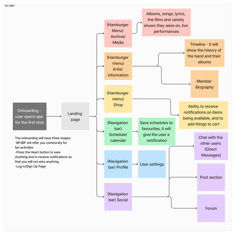
Later, I have created a system map for how the app would actually flow for the users and for other considerations such as the onboarding process. I have made sure to highlight the interactions and categorization on this flow chart to make the visualization for the app’s functions clearer, and to avoid any grave errors later.
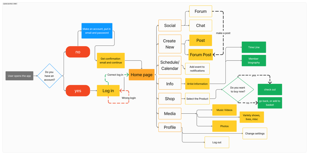
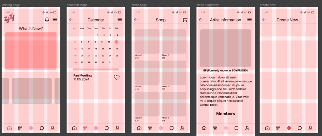
I have applied a few laws of UX to my design in order to improve user satisfaction rates and make the app more usable. According to Yablonski (2024), users spend their time on other websites and apps and might expect consistency across the new apps they discover – this is the Jakob’s Law. One way in which I have implemented this is through using UI elements that are similar to some popular social media – for example, I have taken slight inspiration from Pinterest when creating the “Create New” screen, as I felt it was fitting and most users would find it usable due to the similarities and not having to adjust over again to something new.
The system map for BF4BF is meant to show the route that a user would go through when using the app, primarily focusing on how different cirucmstances (for example, putting in the wrong password) can have an effect on the order in which an app is being navigated through. The system map has also allowed me to add more detail to the hierarchal task analysis since it showcases the basic functions and wayfinding of the app.
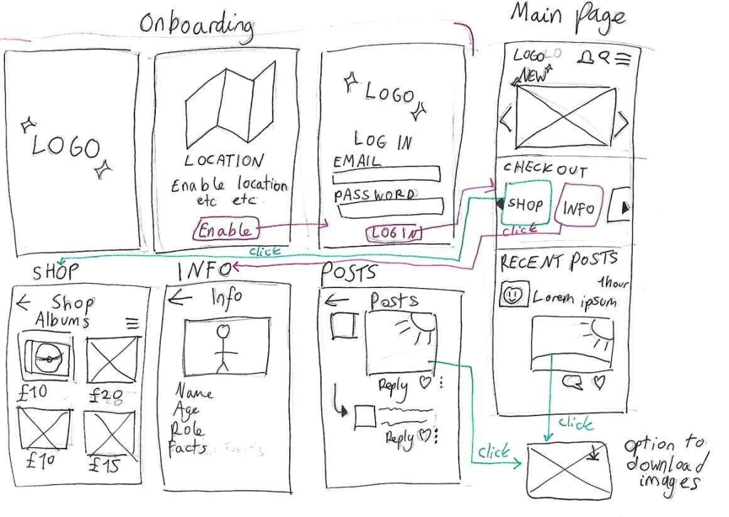
The next step in this process was creating a quick sketch showcasing roughly how the app would work and its layout and style. I have decided to do this before starting to create a wireframe in Figma because
guidelines that were used to create the mid fidelity wireframe
I have created a grid system for the app in order to keep every UI element proportional and to make it easier to design the layout in terms of the hierarchal design rules (the larger an element is, the more important it is considered initially to the user).

Lastly, in the mid fidelity prototype I have tried to make the foundation for the high fidelity prototype, adding a bit more detail to preserve the function of the app and further link back to its purpose.
Referencing
Yablonski, J. (2024) Laws of UX. Available online: https://lawsofux.com/ [Accessed 12/5/2024].