1. Research & Context
REMAKE is a community-focused campaign that is supported by public initiatives which aims to reduce electronic waste through repairing, reusing, and sharing knowledge. The project encourages people to rethink replacing technology as an automatic option, and instead explores creative and practical ways of expanding the life spans of their devices.
This campaign would consist of a series of small books (A5, around 15 pages each) spanning a specific timeline and each book edition would cover different ways to remake, reuse and potentially recycle technology in a DIY project format. This campaign also wants to put emphasis on creativity and helping people engage with real objects instead of overly relying on touch-screen technology.
The target audience for this campaign would be people who use technology regularly but may feel disconnected from how it works physically, whether it’s due to intimidation, lack of experience, or convenience culture. I have decided to focus on a few different generations and how they physically interact with technology.
According to research papers by Jinhui et al. (2015) and Widmer et al. (2005),
Whilst researching different approaches to solve the problem that this brief describes, I have come up with multiple ways to present the information to the target audience in a way that interests and engages them. One main issue that I was struggling with whilst working on this campaign is trying to make sure that the content produced would actually appeal to the target audience I’m targeting. An example of this would be questioning whether books and magazines in any way could capture the attention of people who may not be drawn to books in the first place. My first instinct when trying to answer this was thinking of social media implementation however this also showed another potential issue – there is so much over-stimulating content on social media to the extent that people might not pay attention to everything they are seeing. This is antithetical to the message of this campaign which is trying to connect people through repairing objects and not needlessly upgrading devices.
Before working on idea generation for this project, I have decided to look for real examples of campaigns and design that fulfills a similar purpose to my own project. E-Waste Autopsy by Leyla Acaroglu was an interactive exhibition that explored the underlying reasons behind

Another example of a community or user-driven platform that is based around repairing and reusing electronics is Instructables. This website offers instructional articles on how to build or repair different objects – this specific website has caught my attention because it has a human-centered approach to it and doesn’t feel overly technical or intimidating for beginners. An example of the human-centered approach can be found when clicking on options on any article and ‘I Made It’ shows up.

Additionally, another example of design that felt extremely relevant to this campaign was the book Things Come Apart by Todd McLellan. This book explores all the micro-functions of technological devices through photography and

2. Conceptual Development

This is a physical mood board I put together to have a better idea on not only the style, colours and typography to use in this campaign, but also the texture and tactile feeling. This was important to me at this stage because it allowed me to think through a different perspective and not just agree with my intuition.
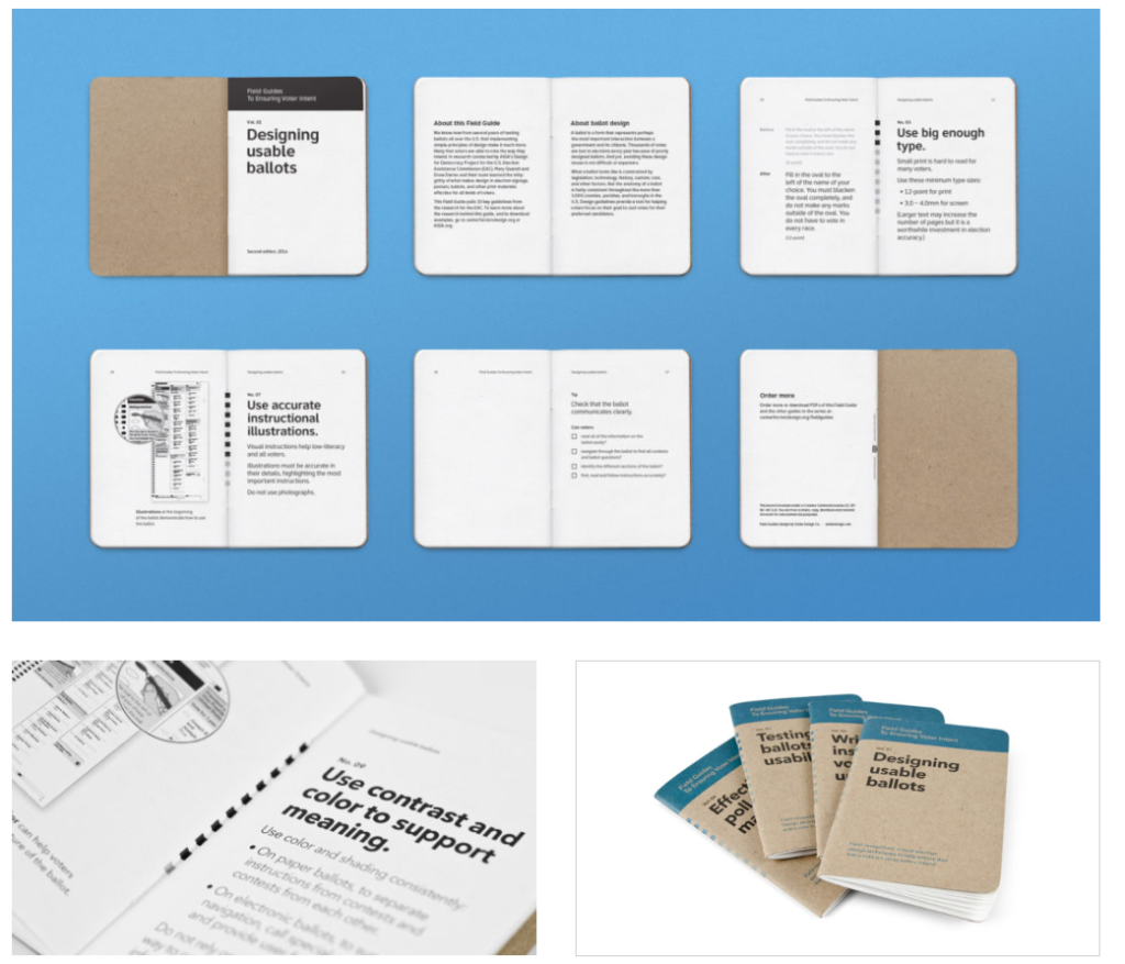
An idea that I wasn’t initially even considering was taking inspiration from field guides which was surprisingly influential in the style and pacing of the book.
3. Experimentation & Prototyping

When I was working on this project, there was one issue I kept coming back to – I kept getting stuck on a specific idea or layout and I wasn’t sure how to continue working on it further. One idea I had to counteract this problem was to pick up random objects or materials and try to relate it back to this campaign so that I can break out of my conventional thought patterns and hopefully think of a more effective, unusual approach. An example of this was when I used nail polish to create a typographical experiment due to the fitting colours of the polish and its interesting texture. Later, I decided to scan it in and add it to a poster to create type that has a human-made aspect to it instead of sticking to a technical, perfectly measured typeface.
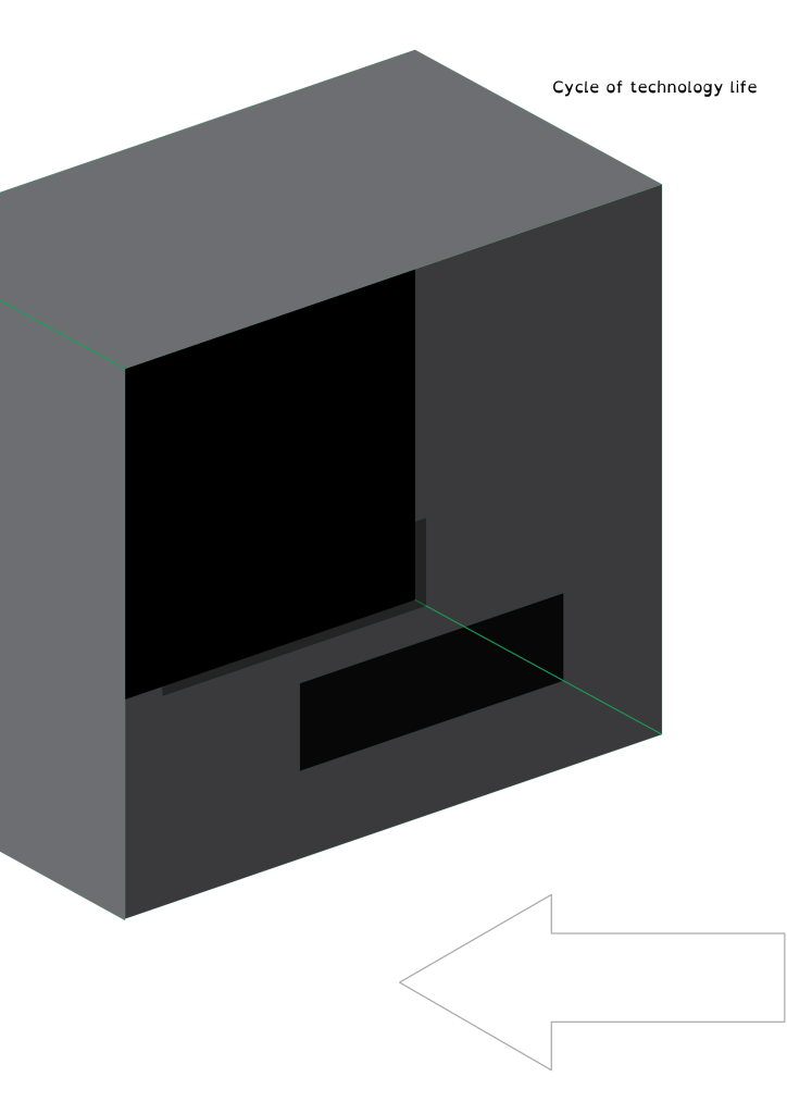
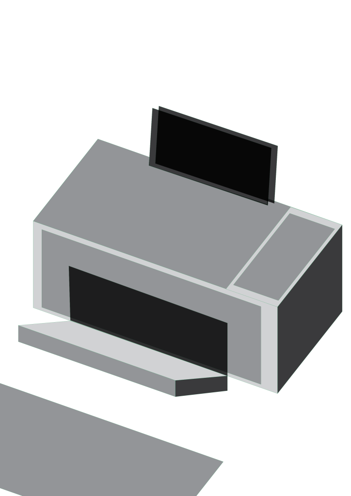
When I was early in development for this project, I tried to create loose silhouettes out of shapes to create impressions of technological devices. Additionally, I took slight inspiration from the Cubist movement, particularly the idea that “the essence of an object and its basic characteristics, rather than its outward appearance, was depicted” (Meggs, 2012). This quote informed my decision to make the illustrations more fragmented,
Posters were meant to be a part of the campaign which brings attention to workshops happening, the book existing,
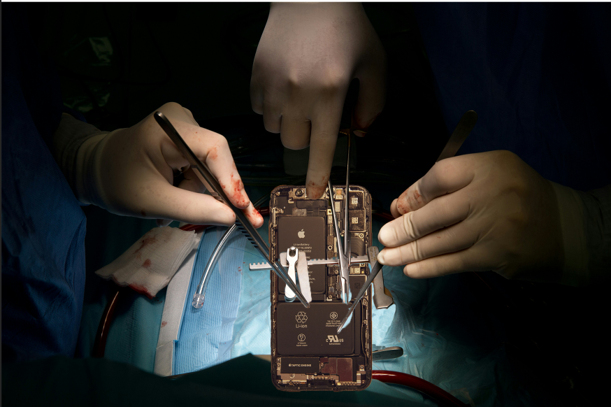
I have also tried exploring the idea of technology as a living thing or a body, which led me to creating this experimental collage of surgery being done on a phone. Although I knew this take on the subject would be too morbid to include, it allowed me to
4. User Testing & Feedback
When creating prototypes and mockups for this campaign, I have made sure to ask for feedback from a variety of people so that my designs can be checked for issues that I might have not noticed from looking at them for too long. The first feedback I received on the book specifically is that the text was too small and sometimes difficult to read, which led me to be more careful and intentional with text placement so that it can be accessible to as many people as possible. An idea that someone proposed about this project that I thought was incredibly useful was adding more accessibility implementations such as the website providing a voiceover of the book so that people with poor vision could try the tutorials as well.

Another feedback I received and implemented was various adjustments to the layout – I asked numerous people whether anything felt wrong with the layouts and tried out their suggestions. Although I mainly relied on the grid system and my own intuition, the suggestions – which were things such as the direction and the flow of the text, and
5. Informed Design Decisions & Direction
When designing the book, I tried my best to follow the practices of printing an actual book; for example, I kept in mind the correct gutter sizing, typical practices and colour settings so that they could work in print. I have planned the technical details for how this book would
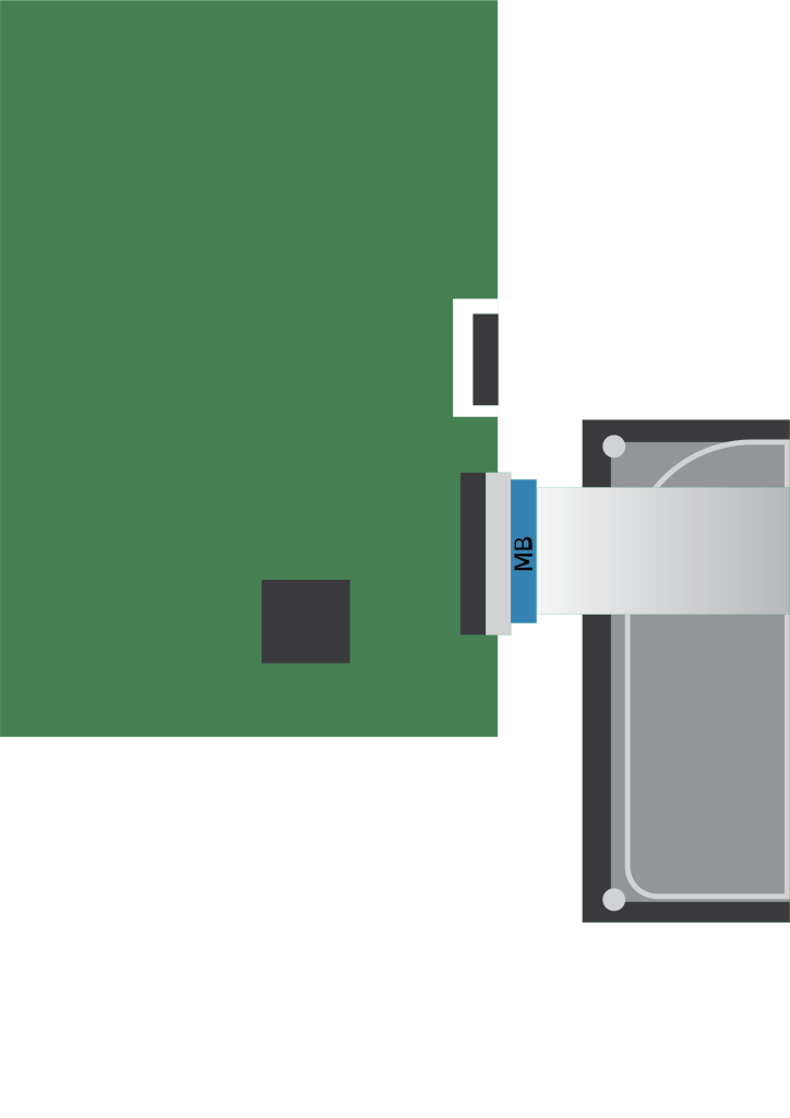
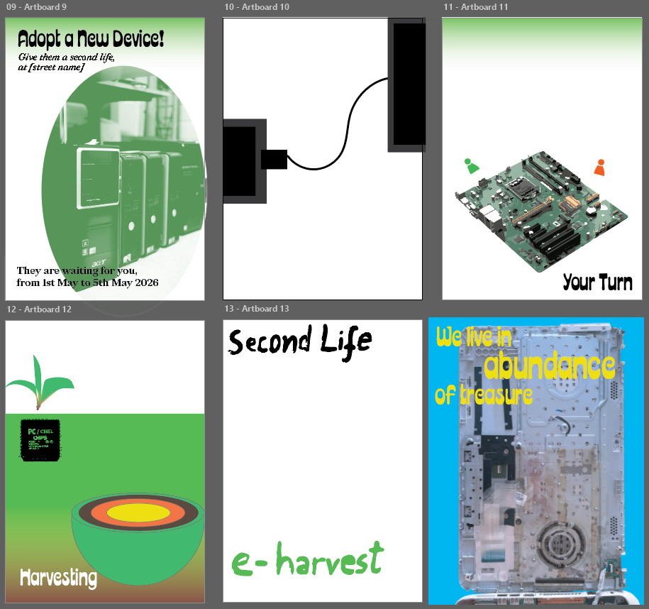
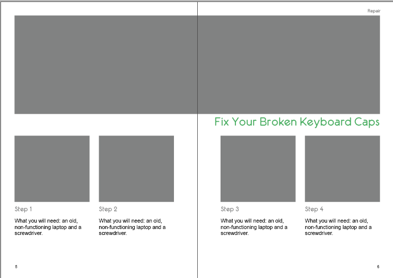
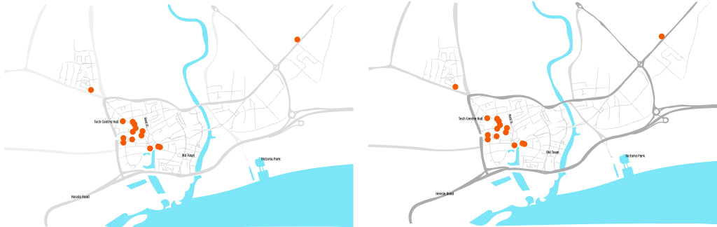
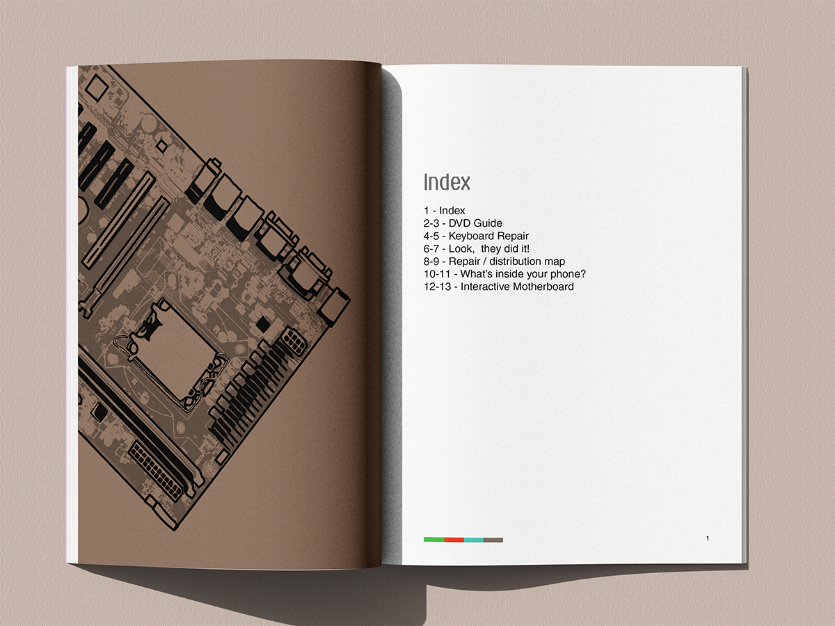
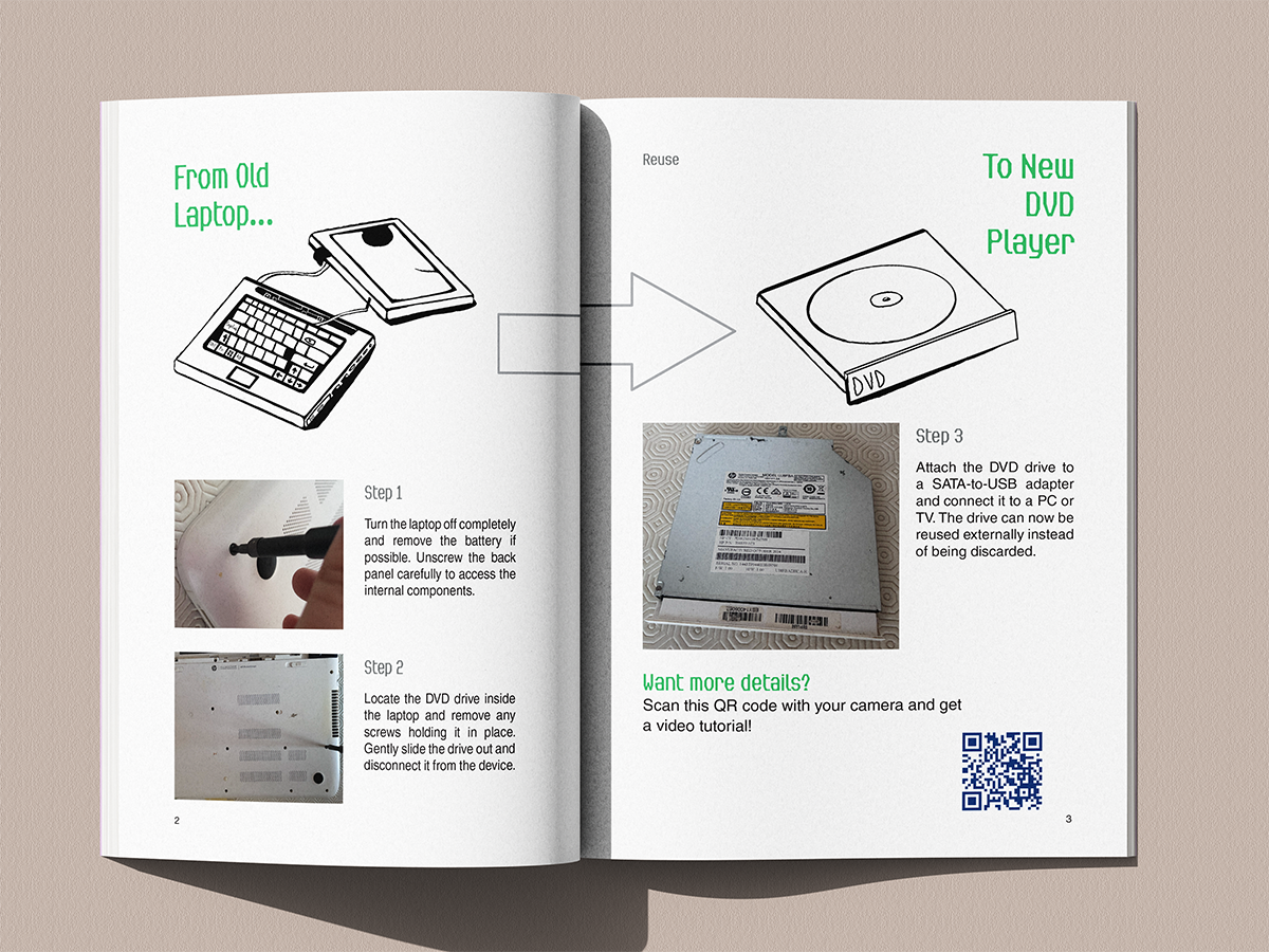
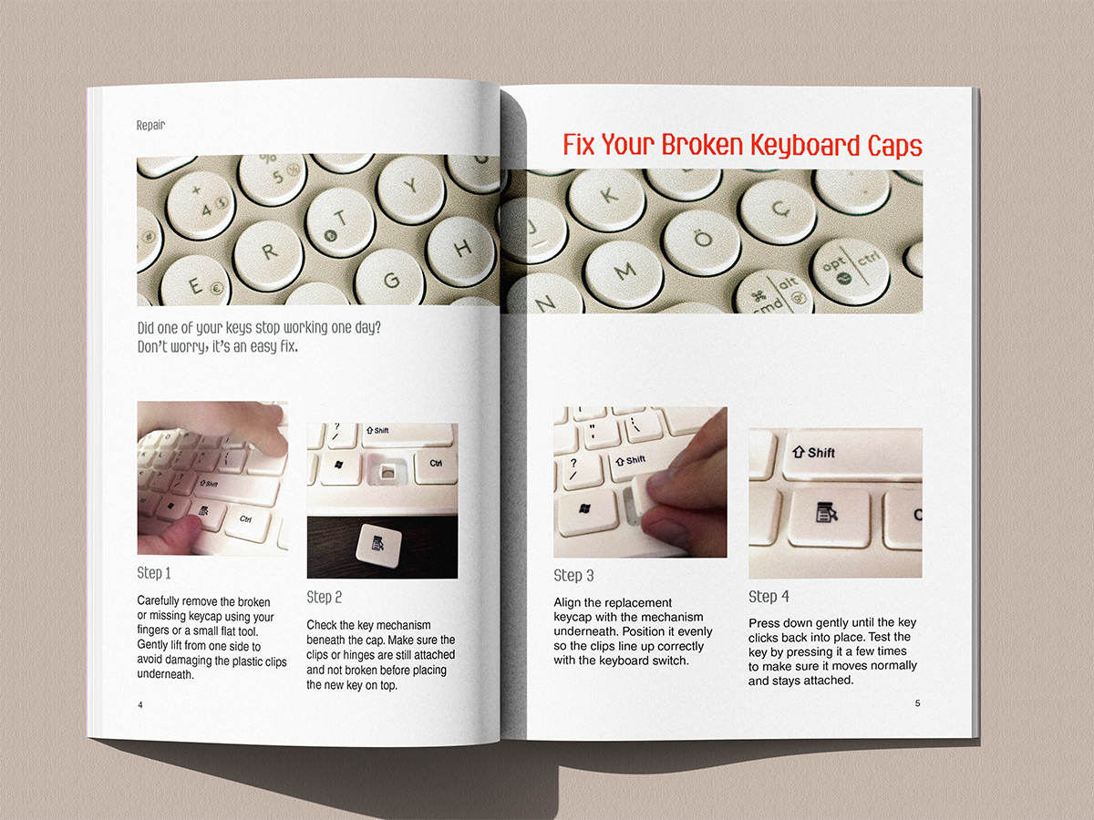
All Pages of the Book
Mobile Website UI (Clickable/scrollable)
References
They are expandable
Bibliography
- Kumar, A. (2019) Exploring young adults’ e-waste recycling behaviour using an extended theory of planned behaviour model: A cross-cultural study. Resources, Conservation and Recycling. 141, 378-389. DOI:https://doi-org.hull.idm.oclc.org/10.1016/j.resconrec.2018.10.013
- Jinhui L., Xianlai Z., Mengjun C., Oladele A., O., Ab S. (2015) “Control-alt-delete”: Rebooting solutions for the e‑waste problem. Environmental Science & Technology, 49(12). DOI: https://doi.org/10.1021/acs.est.5b00449
- Widmer, R., Oswald-Krapf, H., Sinha-Khetriwal, D., Schnellmann, M., Böni, H. (2005) Global perspectives on e-waste. Environemtnal Impact Assessment Review, 25(5), 436-458. DOI: https://www.sciencedirect.com/science/article/abs/pii/S0195925505000466?fr=RR-2&ref=pdf_download&rr=9cbe43ff3da8b0fe\
- Meggs, P., Purvis, A. (2012) Meggs’ History of Graphic Design, Fifth Edition. John Wiley & Sons.
- Acaroglu, L. (2014) E-Waste Autopsy.
- Instructables (2026) https://www.instructables.com/ [Accessed 20th March 2026].
- McLellan, T. (2013) All Things Come Apart.
- DSIT (2026) The IT reuse for good charter. https://www.gov.uk/government/publications/it-reuse-for-good-charter/the-it-reuse-for-good-charter [Accessed 20th March 2026].
- Good Things Foundation (2026) Good Things Foundation helps launch new government-backed IT reuse charter. https://www.goodthingsfoundation.org/discover/our-news/our-news-2025/it-reuse-charter [Accessed 20th March 2026].
- Environmental Audit Committee (2026) Electronic Waste and the Circular Economy. UK Parliament. https://committees.parliament.uk/work/170/electronic-waste-and-the-circular-economy/news/ [Accessed 20th March 2026].
- Gillespie, L. (2025) The growing challenge of e-waste and the path toward a circular economy. https://www.techuk.org/resource/the-growing-challenge-of-e-waste-and-the-path-toward-a-circular-economy.html [Accessed 20th March 2026].
- IFIXIT (2026) https://www.ifixit.com/en-gb/Store [Accessed 20th March 2026].
- Oxide Design (2025) Field guides to ensuring voter intent. https://oxidedesign.com/case-studies/field-guides/ [Accessed 20th March 2026].
- Library of Things (2026) https://www.libraryofthings.co.uk/ [Accessed 20th March 2026].
Photography/Imagery
Pexels
1. cottonbro studio (2020) Close up of hands repairing electronic device using soldiering iron and pliers. [Photograph]. https://www.pexels.com/photo/person-in-white-long-sleeve-shirt-holding-black-smartphone-4705606/ [Accessed 2nd May 2026].
2. Bulat843 (2025) Technician carefully examining an electronic part inside a machinery panel [Photograph]. https://www.pexels.com/photo/technician-inspecting-electronic-component-34054470/ [Accessed 2nd May 2026].
3. Nilov, M. (2021) Engineer skillfully soldering components on a motherboard in a tech workshop. [Photograph]. https://www.pexels.com/photo/close-up-photo-of-motherboard-being-fixed-by-a-person-9242898/ [Accessed 2nd May 2026].
4. Frig, G. (2021) Detailed view of soldering work on a circuit board, highlighting precision in electronics repair. [Photograph]. https://www.pexels.com/photo/close-up-of-a-man-soldering-7447036/ [Accessed 2nd May 2026].
5. Miroshnichenko, T. (2021) Detailed shot of smartphone repair with a screwdriver and hand close-up. [Photograph]. https://www.pexels.com/photo/a-hand-fixing-an-electronic-device-using-screwdriver-6755075/ [Accessed 2nd May 2026].
6. Thirdman (2021) Close-up of hands soldering electronics with tools on a wooden table during a teamwork session.[Photograph]. https://www.pexels.com/photo/a-person-holding-a-soldering-iron-7180752/ [Accessed 2nd May 2026].
7. cottonbro studio (2020) Adults working together to repair a computer using tools like a screwdriver and soldering iron. [Photograph]. https://www.pexels.com/photo/person-in-green-sweater-playing-audio-mixer-4705603/ [Accessed 2nd May 2026].
8. Willquezada (2021) Close-up of hands assembling an electronic circuit board, showcasing teamwork and technical expertise. [Photograph]. https://www.pexels.com/photo/closeup-of-hands-composing-an-electronic-equipment-11679118/ [Accessed 2nd May 2026].
9. Fotografia Lui Vlad (2025) Close-up of disassembled smartphone parts on a blue repair mat with tools.[Photograph]. https://www.pexels.com/photo/disassembled-smartphone-on-repair-workbench-31862950/ [Accessed 2nd May 2026].
10. Lusina, A. (2025) Close-up of a person tightening screws on a PC case for maintenance. [Photograph]. https://www.pexels.com/photo/pc-case-maintenance-screwdriver-adjustments-31854228/ [Accessed 2nd May 2026].
11. Miroshnichenko, T. (2021) A focused view of repairing a smartphone circuit board with tools by hand. [Photograph]. https://www.pexels.com/photo/person-holding-black-iphone-4-6755053/ [Accessed 2nd May 2026].
12. Anez, A. (2023) Close-up image of a hand holding a circuit board from a hard drive, showcasing electronic technology. [Photograph]. https://www.pexels.com/photo/close-up-of-a-person-holding-a-computer-component-18734809/ [Accessed 2nd May 2026].
13. Anez, A. (2023) Person using air duster to clean a computer fan inside a desktop case. [Photograph]. https://www.pexels.com/photo/efficient-computer-fan-cleaning-process-31854230/ [Accessed 2nd May 2026].
14. Anez, A. (2023) Close-up of unscrewing a PC’s back panel for DIY maintenance. [Photograph]. https://www.pexels.com/photo/diy-pc-maintenance-back-panel-unscrewing-31854237/ [Accessed 2nd May 2026].
15. Gamez, E. (2021) Close-up of hand applying thermal paste to a laptop microchip for maintenance. [Photograph]. https://www.pexels.com/photo/hand-of-a-person-using-s-syringe-on-a-computer-part-10558600/ [Accessed 2nd May 2026].
16. Mediahooch Pixels (2023) Woman repairing a laptop at a desk with tools, showcasing technology and skill. [Photograph]. https://www.pexels.com/photo/a-woman-repairing-laptop-16385070/ [Accessed 2nd May 2026].
17. Cavus, H. (2025) Ergonomic wireless keyboard and transparent mouse on a white desk, sleek and modern design. [Photograph]. https://www.pexels.com/photo/minimalist-wireless-keyboard-and-mouse-setup-34030131/ [Accessed 2nd May 2026].
18. Liao, J. (2023) Elderly man repairing a personal stereo in a workshop, showcasing self-employment skills. [Photograph]. https://www.pexels.com/photo/elderly-man-working-in-a-workshop-15881335/ [Accessed 2nd May 2026].
19. Miroshnichenko, T. (2021) Classic wooden radio with dials, evoking nostalgia and retro style. [Photograph]. https://www.pexels.com/photo/wood-restaurant-fashion-man-6827342/ [Accessed 2nd May 2026].
20. Pad, H. (2021) Modern laptop with a blank screen for mockup use in a soft indoor setting. [Photograph]. https://www.pexels.com/photo/close-up-shot-of-a-laptop-8534039/ [Accessed 2nd May 2026].
Unsplash
1. Revendo (2022) A person holding a laptop. [Photograph]. https://unsplash.com/photos/a-person-holding-a-laptop-7x0dGJqbfgk [Accessed 2nd May 2026].
2. Clement, H. (2023) A row of black computers sitting on top of a table. [Photograph]. https://unsplash.com/photos/a-row-of-black-computers-sitting-on-top-of-a-table-IvUCu_u5hjI [Accessed 2nd May 2026].
3. Cameron, J. (2021) Domestic appliances being recycled. [Photograph]. https://unsplash.com/photos/black-and-gray-computer-keyboard-on-brown-wooden-table-7zocFMzvbpc [Accessed 2nd May 2026].
4. Cameron, J. (2020) Computers and televisions for recycling. [Photograph]. https://unsplash.com/photos/white-and-black-computer-tower-Z7pQAI0KLBg [Accessed 2nd May 2026].
5. Cima, N. (2024) Stack of graphic cards and motherboards in a landfill site. [Photograph]. https://unsplash.com/photos/a-pile-of-assorted-electronic-components-sitting-on-top-of-each-other-G09BIFdUAGU [Accessed 2nd May 2026].
6. Gu, C. (2023) A pile of old televisions and books on a table. [Photograph]. https://unsplash.com/photos/a-pile-of-old-televisions-and-books-on-a-table-SRzAdIbgKGE [Accessed 2nd May 2026].
7. Messifet, N. (2021) Black smartphone on brown wooden table. [Photograph]. https://unsplash.com/photos/black-smartphone-on-brown-wooden-table-_fTihc8wRTw [Accessed 2nd May 2026].
8. Spiske, M. (2020) Defect TV illegal garbage dump pollution of the environment. [Photograph]. https://unsplash.com/photos/white-and-black-vintage-tv-on-green-grass-during-daytime-f6IS1bAZao4 [Accessed 2nd May 2026].
9. Ostrikov, S. (2023) A pile of televisions sitting on top of each other. [Photograph]. https://unsplash.com/photos/a-pile-of-televisions-sitting-on-top-of-each-other-D90iCm3_EXo [Accessed 2nd May 2026].
10. Sulyok, A. (2025) A group of people doing surgery in a dark room. [Photograph]. https://unsplash.com/bookmarks?asset=%5B%22Photos%22%2C%7B%22slug%22%3A%22a-group-of-people-doing-surgery-in-a-dark-room-1hZZzCuPGJQ%22%7D%5D [Accessed 2nd May 2026].
11. Molliver, J. (2020) Yellow and black handle hammer and screwdriver. [Photograph]. https://unsplash.com/photos/yellow-and-black-handle-hammer-and-screw-driver-Z3vFp7szCAY [Accessed 2nd May 2026].
12. Jans, D. (2021) White ipad on white keyboard photo. [Photograph]. https://unsplash.com/photos/white-ipad-on-white-keyboard-UHYgUASn-0g [Accessed 2nd May 2026].
13. Chernichenko, N. (2018) Silver laptop on white surface. [Photograph]. https://unsplash.com/photos/silver-laptop-computer-on-white-surface-eqojpEtCkNI [Accessed 2nd May 2026].
14. Joppien, J. (2016) Broken display glass. [Photograph]. https://unsplash.com/photos/shattered-monitor-on-the-floor-XFUqd0u5U7w [Accessed 2nd May 2026].
Other
1. EspritCabane (2008) Bijoux en touches de clavier. [Photograph]. https://www.espritcabane.com/loisirs-creatifs/eco-creations/bijoux-clavier-ordi/ [Accessed 2nd May 2026].
Mockups
1. Mockups Design (2025) Sleek A4 brochure mockup. [Mockup]. https://mockups-design.com/sleek-a4-brochure-mockup/ [Accessed 2nd May 2026].
Leave a Reply